
# Attio — DESIGN.md

> agentic claim x living CRM

**Aesthetic:** Product Keynote · **Mode:** persuade · **Color strategy:** restrained · **Focus:** hero
**Reference:** https://attio.com/ (captured 2026-09-18)

Match the feel of this reference, not its content. Hexes and measurements are sampled from the page; type character, materials, and direction are interpreted from screenshots.

A white keynote-style CRM page uses a blunt centered claim, paired actions, a faint cool glow, and a huge working database window to make product behavior—not decoration—the hero.

## Colors

| Hex | Role |
|---|---|
| `#ffffff` | page ground |
| `#242629` | primary ink and action |
| `#7e8794` | secondary ink |
| `#eef3ff` | product glow field |
| `#8aa9ff` | interface signal |
| `#e7e9ed` | borders and wells |

## Typography

- **Display:** Inter Display at ~72px bold, centered, one line with tight tracking
- **Body:** Inter at ~20px regular in cool gray
- **Labels:** Inter medium at 13–16px; JetBrains Mono reserved for developer readouts

## Materials

- white screen ground
- cool blue light wash
- real CRM table
- hairline interface borders
- browser traffic lights
- small colored data pills

## Signature details

- white keynote ground
- centered heavy grotesk
- oversized CRM window
- faint blue vertical glow
- browser traffic lights
- pill announcement link
- real-scale data table

## Direction

### THESIS

the database is alive and working, so the product window should occupy more visual authority than any brand illustration. It refuses abstract agent characters and floating feature icons.

### OWN-WORLD

white ground, charcoal #242629 ink, cool gray copy, a nearly invisible blue #eef3ff light wash behind the product, and tiny interface colors confined to real data pills. Use Inter Display for the centered claim and Inter throughout the product shell; JetBrains Mono appears only where the interface contains code or data. Components are lightly rounded, hairline-bordered, and compact.

### STORY

the visitor reads the agentic revenue position, chooses sales or self-serve, then immediately inspects the CRM table before moving through autonomous lead, renewal, context, SDK, and reporting scenes.

### FIRST VIEWPORT

run a black announcement strip over a white nav. Center a small outlined announcement pill, one large single-line headline, a two-line gray lead, and two compact actions. From the bottom, raise a browser-like product window to nearly the full content width, with traffic lights, a left rail, filters, collaborator avatars, and a dense table. Place a pale vertical blue light field behind it.

### FORM

a software keynote where the live database is the stage object. Motion: not observed; if added, reveal table rows and agent actions inside the window only.

## Avoid

- Blue-purple gradient panels plus Inter is the saas-gradient cluster; this world survives only when the product UI inside the devices is the star and the gradient is one color, not two.
- Drifting into the `saas-gradient (adjacent: white field, Inter, rounded controls, and a pale blue product glow; the real database interface carries the composition)` AI-default cluster; this reference sits near it, so keep the details that separate it.
# Attio — DESIGN.md

> agentic claim x living CRM

**Aesthetic:** Product Keynote · **Mode:** persuade · **Color strategy:** restrained · **Focus:** hero
**Reference:** https://attio.com/ (captured 2026-09-18)

Match the feel of this reference, not its content. Hexes and measurements are sampled from the page; type character, materials, and direction are interpreted from screenshots.

A white keynote-style CRM page uses a blunt centered claim, paired actions, a faint cool glow, and a huge working database window to make product behavior—not decoration—the hero.

## Aesthetic — Product Keynote

Consumer and developer product marketing in the Apple keynote register: a heavy grotesk headline centered on a light gray or white ground, device mockups (phone, laptop, browser) as the only imagery, pill buttons, and soft colored gradient panels behind the devices. Sections are one claim plus one picture.

- **Vocabulary:** device mockup, keynote headline, pill button, gradient panel, glass nav, feature tile, one claim one picture
- **Materials:** light gray or white ground, phone and laptop frames, soft two-tone gradient panels, frosted nav bar
- **Color strategy:** restrained

## Colors

| Hex | Token | Role |
|---|---|---|
| `#ffffff` | `--color-page-ground` | page ground |
| `#242629` | `--color-primary-ink-and-action` | primary ink and action |
| `#7e8794` | `--color-secondary-ink` | secondary ink |
| `#eef3ff` | `--color-product-glow-field` | product glow field |
| `#8aa9ff` | `--color-interface-signal` | interface signal |
| `#e7e9ed` | `--color-borders-and-wells` | borders and wells |

## Typography

- **Display:** Inter Display at ~72px bold, centered, one line with tight tracking
- **Body:** Inter at ~20px regular in cool gray
- **Labels:** Inter medium at 13–16px; JetBrains Mono reserved for developer readouts
- **Detected fonts:** Inter, Inter Display, JetBrains Mono, Tiempos Text

## Materials

- white screen ground
- cool blue light wash
- real CRM table
- hairline interface borders
- browser traffic lights
- small colored data pills

## Signature details

- white keynote ground
- centered heavy grotesk
- oversized CRM window
- faint blue vertical glow
- browser traffic lights
- pill announcement link
- real-scale data table

## Direction

### THESIS

the database is alive and working, so the product window should occupy more visual authority than any brand illustration. It refuses abstract agent characters and floating feature icons.

### OWN-WORLD

white ground, charcoal #242629 ink, cool gray copy, a nearly invisible blue #eef3ff light wash behind the product, and tiny interface colors confined to real data pills. Use Inter Display for the centered claim and Inter throughout the product shell; JetBrains Mono appears only where the interface contains code or data. Components are lightly rounded, hairline-bordered, and compact.

### STORY

the visitor reads the agentic revenue position, chooses sales or self-serve, then immediately inspects the CRM table before moving through autonomous lead, renewal, context, SDK, and reporting scenes.

### FIRST VIEWPORT

run a black announcement strip over a white nav. Center a small outlined announcement pill, one large single-line headline, a two-line gray lead, and two compact actions. From the bottom, raise a browser-like product window to nearly the full content width, with traffic lights, a left rail, filters, collaborator avatars, and a dense table. Place a pale vertical blue light field behind it.

### FORM

a software keynote where the live database is the stage object. Motion: not observed; if added, reveal table rows and agent actions inside the window only.

## Hero image prompt

Replace the `[SUBJECT]` with your own subject, then send to Higgsfield gpt_image_2 @ 2K.

```text
[SUBJECT: a structured CRM database with companies, deal signals, and agent suggestions] rendered as a real white software table inside a wide browser window, hairline gray borders, tiny blue, lilac, mint, and amber data pills, faint cool-blue light behind the frame, straight-on view, no text, no decorative objects, generous white space above
```

## Avoid

- Blue-purple gradient panels plus Inter is the saas-gradient cluster; this world survives only when the product UI inside the devices is the star and the gradient is one color, not two.
- Drifting into the `saas-gradient (adjacent: white field, Inter, rounded controls, and a pale blue product glow; the real database interface carries the composition)` AI-default cluster; this reference sits near it, so keep the details that separate it.

## Guardrails

### Always
- Commit to one visual world per page; one hand made everything.
- Real content and real product truth. No invented customers, prices, or benchmarks.
- A visible primary action within the first viewport on persuade surfaces.
- Type set with intent: a display face with a point of view, sizes from a scale, tabular numerals for data.
- Motion with weight: staggered reveals, long easing, nothing bouncy.
- Transitions between hero and body that feel designed, not a hard cut.

### Never
- Purple or blue-purple gradients, glowing edges, "3D SaaS blobs".
- Inter (or any default system grotesk) as the display face.
- The AI default clusters unless the brief pins them: cream ground + high-contrast serif + terracotta accent; near-black + one neon accent; broadsheet hairlines + italic serif + tracked mono labels.
- Generic feature grids of three icon cards.
- Stock illustration mixed with photography.
- Emoji as icons.
- Centered-everything layouts with no reading order.

## Quick start

### CSS custom properties

```css
:root {
  /* Colors */
  --color-page-ground: #ffffff;
  --color-primary-ink-and-action: #242629;
  --color-secondary-ink: #7e8794;
  --color-product-glow-field: #eef3ff;
  --color-interface-signal: #8aa9ff;
  --color-borders-and-wells: #e7e9ed;
}
```

### Tailwind v4

```css
@theme {
  /* Colors */
  --color-page-ground: #ffffff;
  --color-primary-ink-and-action: #242629;
  --color-secondary-ink: #7e8794;
  --color-product-glow-field: #eef3ff;
  --color-interface-signal: #8aa9ff;
  --color-borders-and-wells: #e7e9ed;
}
```

### Extracted from the live site

```css
--color-page-background: lab(99.9987% .0337958 .000309944);
--color-banner-background: lab(0% 0 0);
--site-header-nav-height: 68px;
--button-outline-border: lab(83.208% -.844151 -5.26234);
```

## Similar in the library

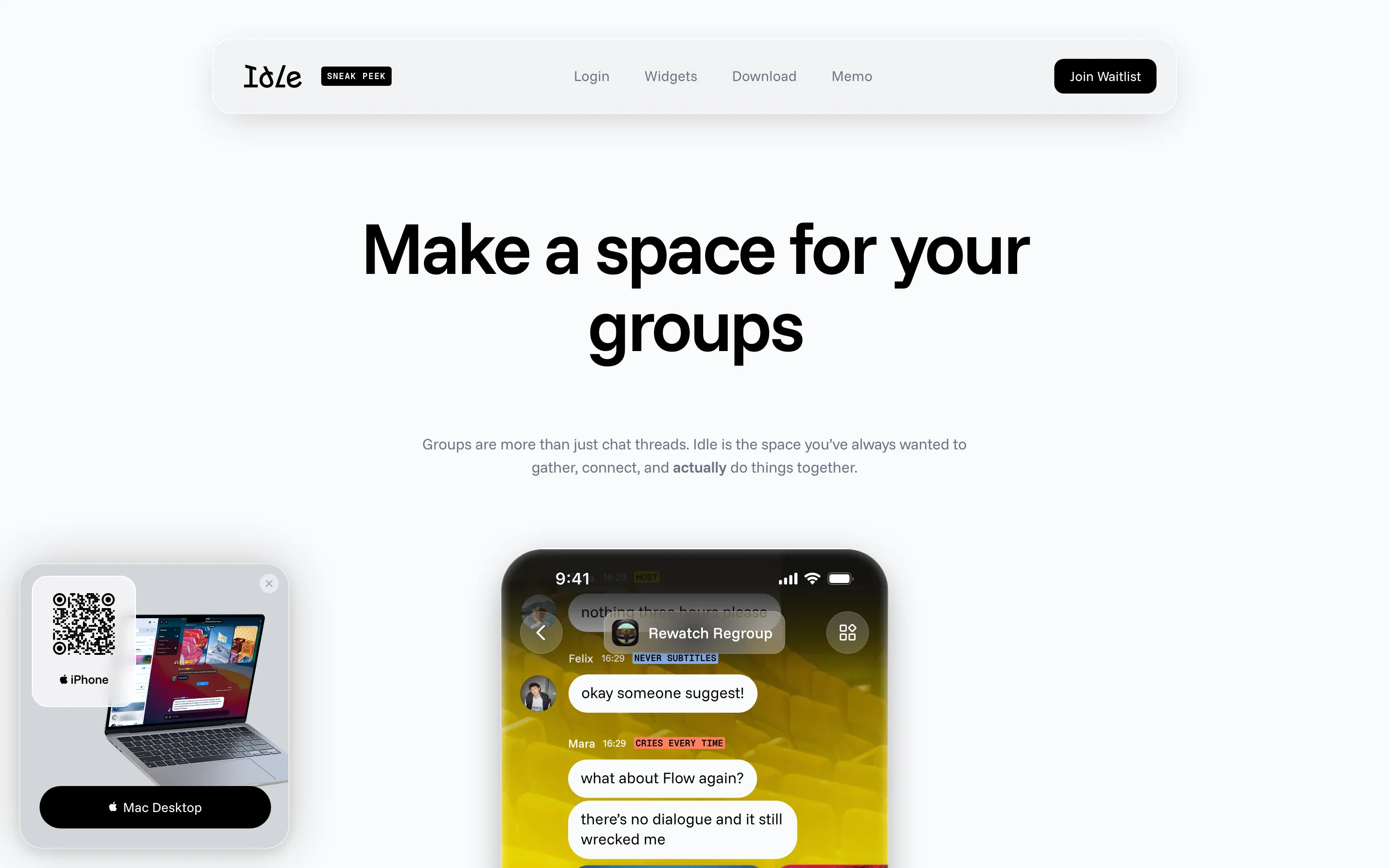
- **Idle** — keynote grotesk x saturated phone screens (https://idle.space/). Screenshot: library/idle/hero.png
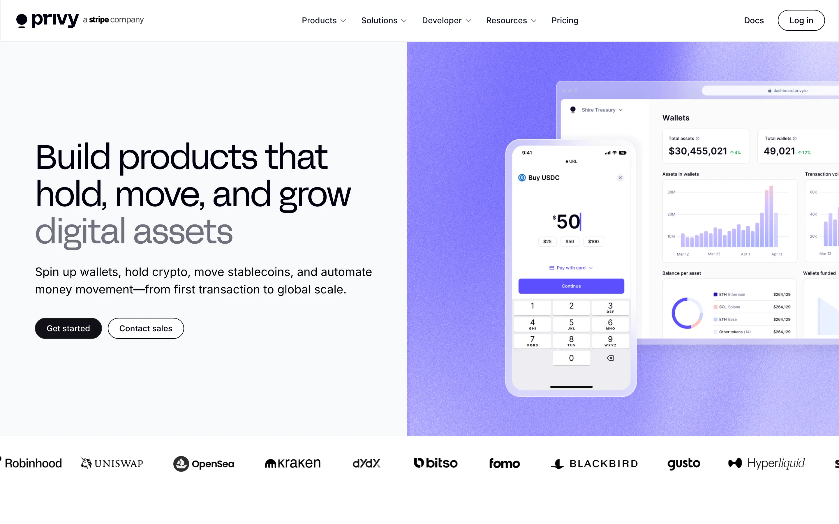
- **Privy** — grotesk keynote x lavender product panel (https://www.privy.io/). Screenshot: library/privy/hero.png
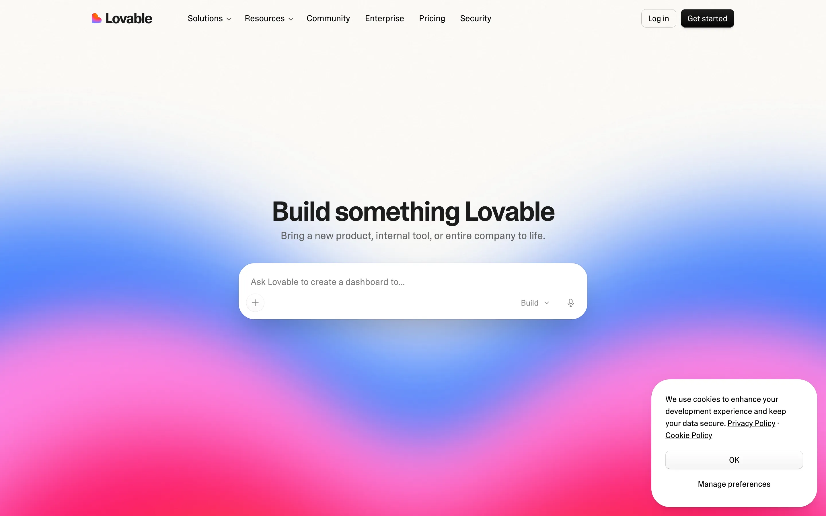
- **Lovable** — prompt box x sunset gradient (https://lovable.dev/). Screenshot: library/lovable/hero.png
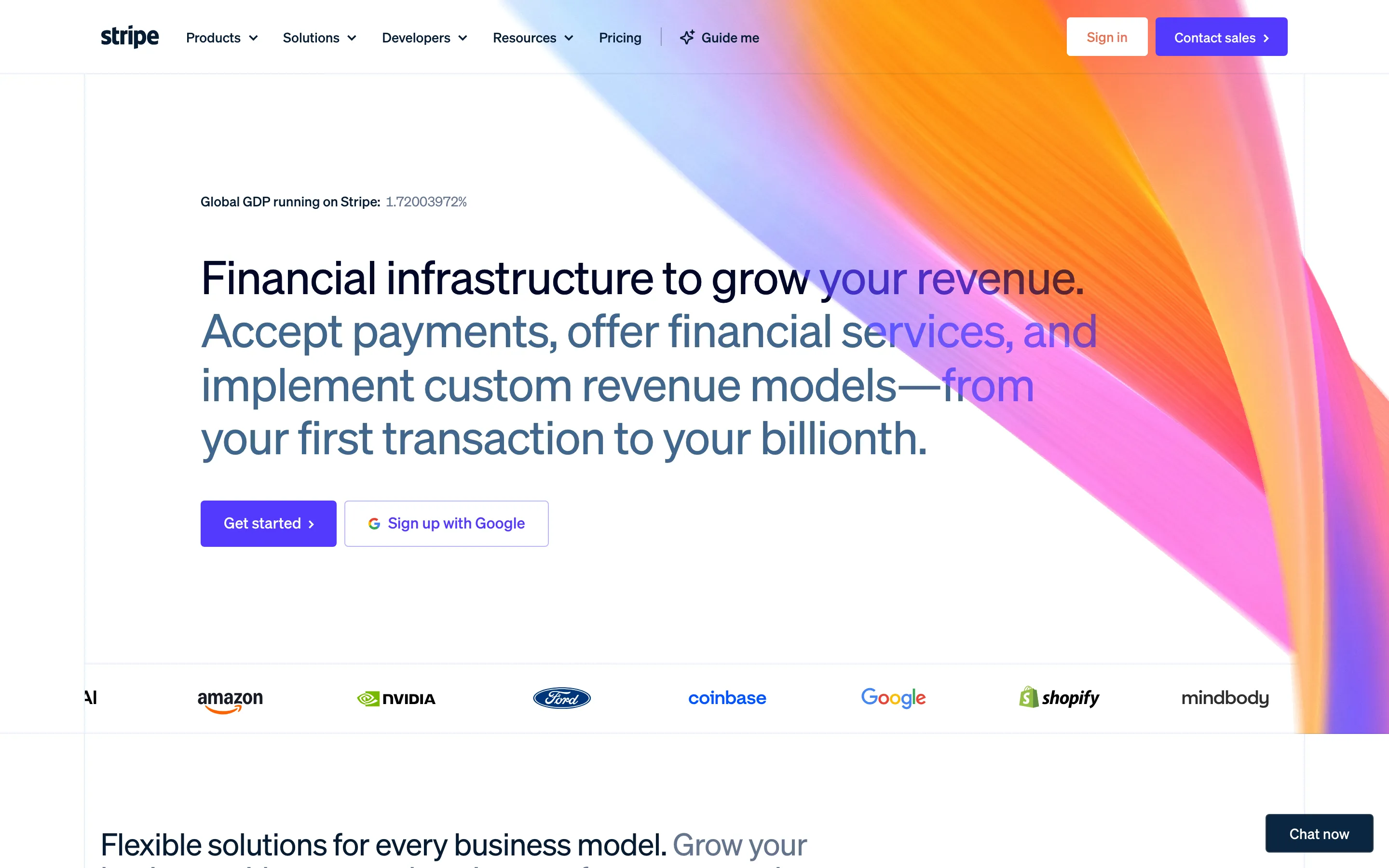
- **Stripe** — spectrum ribbon x commerce systems (https://stripe.com/). Screenshot: library/stripe/hero.png

## Reference files

- Site: https://attio.com/
- Hero screenshot: library/attio/hero.png
- Full-page screenshot: library/attio/full.png