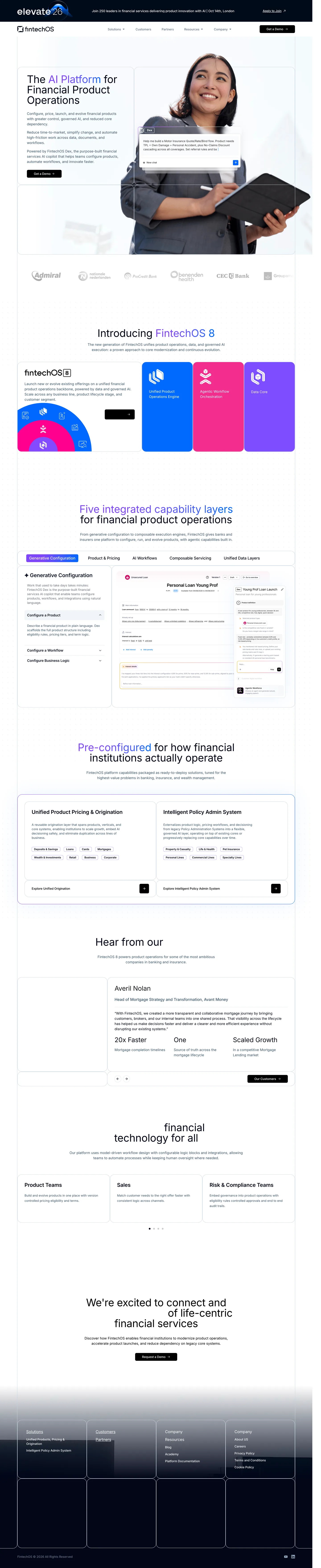
# FintechOS — DESIGN.md

> portrait cutout x product blueprint

**Aesthetic:** Blueprint Enterprise · **Mode:** persuade · **Color strategy:** full-palette · **Focus:** full
**Reference:** https://fintechos.com/ (captured 2026-09-18)

Match the feel of this reference, not its content. Hexes and measurements are sampled from the page; type character, materials, and direction are interpreted from screenshots.

A financial platform makes its product architecture tangible through a pale blueprint grid, large rounded compartments, a human cutout threaded through the hero, and vivid capability blocks backed by real interface evidence.

## Colors

| Hex | Role |
|---|---|
| `#ffffff` | main ground |
| `#f8fafc` | blueprint panel ground |
| `#020617` | headline and footer ink |
| `#3e576d` | body copy |
| `#146cff` | engine block |
| `#f22488` | workflow block |
| `#7a42ff` | data block and headline accent |

## Typography

- **Display:** InterDisplay at ~64px regular, sentence case, compact leading; selected phrases carry a violet-to-blue fill
- **Body:** Inter at ~18px in blue-gray, medium line length and open leading
- **Labels:** Inter semibold at ~11–14px inside tabs, pills, card headers, and black rectangular actions

## Materials

- faint blueprint line grid
- large rounded glass panels
- studio portrait cutout
- layered product windows
- flat saturated feature blocks
- dark translucent footer wells

## Signature details

- pale blueprint grid
- human portrait cutout
- overlapping copilot window
- rounded compartment borders
- violet gradient headline
- saturated capability blocks
- tabbed product screenshot
- modular evidence cards
- dark gradient footer

## Direction

### THESIS

an enterprise platform becomes understandable when every capability is given a visible compartment and those compartments lock into one blueprint. It refuses floating icon trios without product evidence.

### OWN-WORLD

white and ice-gray (#f8fafc) grounds sit on an extremely faint blue construction grid. Near-black (#020617) handles claims and actions; blue-gray (#3e576d) carries copy. Electric blue (#146cff), magenta (#f22488), and violet (#7a42ff) identify three capability layers. InterDisplay headlines are large and regular rather than heavy, with selected phrases filled violet-to-blue. Use large rounded rectangles with hairline blue-gray borders, shared edges, and almost no shadow. Human portrait cutouts cross cell boundaries while product windows sit in front of them.

### STORY

the visitor meets the platform and its copilot, sees customer proof, learns the three-part system, explores five operating layers through a tabbed screenshot, then moves through configured solutions, customer evidence, audience cards, and one centered conversion close.

### FIRST VIEWPORT

an event banner and white navigation stack above a single huge blueprint panel. The left cell holds a four-line ~64px claim, three compact paragraphs, and a black rectangular action. A smiling professional occupies the right two-thirds, cropped at the knees and extending through the cell dividers. A semi-transparent copilot window overlaps the torso near center. Fine grid lines continue behind every object.

### FORM

an architectural product blueprint populated by one person and many working modules. Motion: not observed; tabs may exchange product evidence, but geometry should remain fixed.

## Avoid

- This is the category default; it earns its place only through grid discipline and type scale. Purple-blue gradients, 3D blobs, and icon-card trios are its rut.
- Drifting into the `saas-gradient (Inter, violet-blue headline color, rounded cards, and layered product UI; the continuous blueprint grid and full-scale portrait give the system more structure)` AI-default cluster; this reference sits near it, so keep the details that separate it.
# FintechOS — DESIGN.md

> portrait cutout x product blueprint

**Aesthetic:** Blueprint Enterprise · **Mode:** persuade · **Color strategy:** full-palette · **Focus:** full
**Reference:** https://fintechos.com/ (captured 2026-09-18)

Match the feel of this reference, not its content. Hexes and measurements are sampled from the page; type character, materials, and direction are interpreted from screenshots.

A financial platform makes its product architecture tangible through a pale blueprint grid, large rounded compartments, a human cutout threaded through the hero, and vivid capability blocks backed by real interface evidence.

## Aesthetic — Blueprint Enterprise

B2B enterprise marketing drawn on graph paper: grid-lined grounds (faint on white, blueprint-white on navy), one saturated primary blue with a warm secondary, bold or light grotesk headlines at large scale, stat cards, logo strips, badge walls, and mono caps section labels. The category standard for enterprise software, played with discipline.

- **Vocabulary:** blueprint grid, stat card, logo strip, badge wall, primary blue, mono caps label, pill button, highlighted word
- **Materials:** fine grid lines on the ground, flat color panels, product screenshots in cards, gray stat wells
- **Color strategy:** committed

## Colors

| Hex | Token | Role |
|---|---|---|
| `#ffffff` | `--color-main-ground` | main ground |
| `#f8fafc` | `--color-blueprint-panel-ground` | blueprint panel ground |
| `#020617` | `--color-headline-and-footer-ink` | headline and footer ink |
| `#3e576d` | `--color-body-copy` | body copy |
| `#146cff` | `--color-engine-block` | engine block |
| `#f22488` | `--color-workflow-block` | workflow block |
| `#7a42ff` | `--color-data-block-and-headline-accent` | data block and headline accent |

## Typography

- **Display:** InterDisplay at ~64px regular, sentence case, compact leading; selected phrases carry a violet-to-blue fill
- **Body:** Inter at ~18px in blue-gray, medium line length and open leading
- **Labels:** Inter semibold at ~11–14px inside tabs, pills, card headers, and black rectangular actions
- **Detected fonts:** Inter, InterDisplay

## Materials

- faint blueprint line grid
- large rounded glass panels
- studio portrait cutout
- layered product windows
- flat saturated feature blocks
- dark translucent footer wells

## Signature details

- pale blueprint grid
- human portrait cutout
- overlapping copilot window
- rounded compartment borders
- violet gradient headline
- saturated capability blocks
- tabbed product screenshot
- modular evidence cards
- dark gradient footer

## Direction

### THESIS

an enterprise platform becomes understandable when every capability is given a visible compartment and those compartments lock into one blueprint. It refuses floating icon trios without product evidence.

### OWN-WORLD

white and ice-gray (#f8fafc) grounds sit on an extremely faint blue construction grid. Near-black (#020617) handles claims and actions; blue-gray (#3e576d) carries copy. Electric blue (#146cff), magenta (#f22488), and violet (#7a42ff) identify three capability layers. InterDisplay headlines are large and regular rather than heavy, with selected phrases filled violet-to-blue. Use large rounded rectangles with hairline blue-gray borders, shared edges, and almost no shadow. Human portrait cutouts cross cell boundaries while product windows sit in front of them.

### STORY

the visitor meets the platform and its copilot, sees customer proof, learns the three-part system, explores five operating layers through a tabbed screenshot, then moves through configured solutions, customer evidence, audience cards, and one centered conversion close.

### FIRST VIEWPORT

an event banner and white navigation stack above a single huge blueprint panel. The left cell holds a four-line ~64px claim, three compact paragraphs, and a black rectangular action. A smiling professional occupies the right two-thirds, cropped at the knees and extending through the cell dividers. A semi-transparent copilot window overlaps the torso near center. Fine grid lines continue behind every object.

### FORM

an architectural product blueprint populated by one person and many working modules. Motion: not observed; tabs may exchange product evidence, but geometry should remain fixed.

## Hero image prompt

Replace the `[SUBJECT]` with your own subject, then send to Higgsfield gpt_image_2 @ 2K.

```text
[SUBJECT: a confident financial-services product lead holding a thin tablet] photographed in a bright studio with soft frontal light, isolated full-body cutout over an ice-white (#f8fafc) ground, subtle blue construction-grid lines behind the figure, charcoal clothing, crisp natural skin, no text, no logos, wide landscape frame with the left third empty for a product claim and space across the torso for a translucent interface overlay
```

## Avoid

- This is the category default; it earns its place only through grid discipline and type scale. Purple-blue gradients, 3D blobs, and icon-card trios are its rut.
- Drifting into the `saas-gradient (Inter, violet-blue headline color, rounded cards, and layered product UI; the continuous blueprint grid and full-scale portrait give the system more structure)` AI-default cluster; this reference sits near it, so keep the details that separate it.

## Guardrails

### Always
- Commit to one visual world per page; one hand made everything.
- Real content and real product truth. No invented customers, prices, or benchmarks.
- A visible primary action within the first viewport on persuade surfaces.
- Type set with intent: a display face with a point of view, sizes from a scale, tabular numerals for data.
- Motion with weight: staggered reveals, long easing, nothing bouncy.
- Transitions between hero and body that feel designed, not a hard cut.

### Never
- Purple or blue-purple gradients, glowing edges, "3D SaaS blobs".
- Inter (or any default system grotesk) as the display face.
- The AI default clusters unless the brief pins them: cream ground + high-contrast serif + terracotta accent; near-black + one neon accent; broadsheet hairlines + italic serif + tracked mono labels.
- Generic feature grids of three icon cards.
- Stock illustration mixed with photography.
- Emoji as icons.
- Centered-everything layouts with no reading order.

## Quick start

### CSS custom properties

```css
:root {
  /* Colors */
  --color-main-ground: #ffffff;
  --color-blueprint-panel-ground: #f8fafc;
  --color-headline-and-footer-ink: #020617;
  --color-body-copy: #3e576d;
  --color-engine-block: #146cff;
  --color-workflow-block: #f22488;
  --color-data-block-and-headline-accent: #7a42ff;
}
```

### Tailwind v4

```css
@theme {
  /* Colors */
  --color-main-ground: #ffffff;
  --color-blueprint-panel-ground: #f8fafc;
  --color-headline-and-footer-ink: #020617;
  --color-body-copy: #3e576d;
  --color-engine-block: #146cff;
  --color-workflow-block: #f22488;
  --color-data-block-and-headline-accent: #7a42ff;
}
```

### Extracted from the live site

```css
--dex-space-4: 4px;
--dex-space-8: 8px;
--dex-space-12: 12px;
--dex-space-16: 16px;
--dex-space-24: 24px;
--dex-space-32: 32px;
```

## Similar in the library

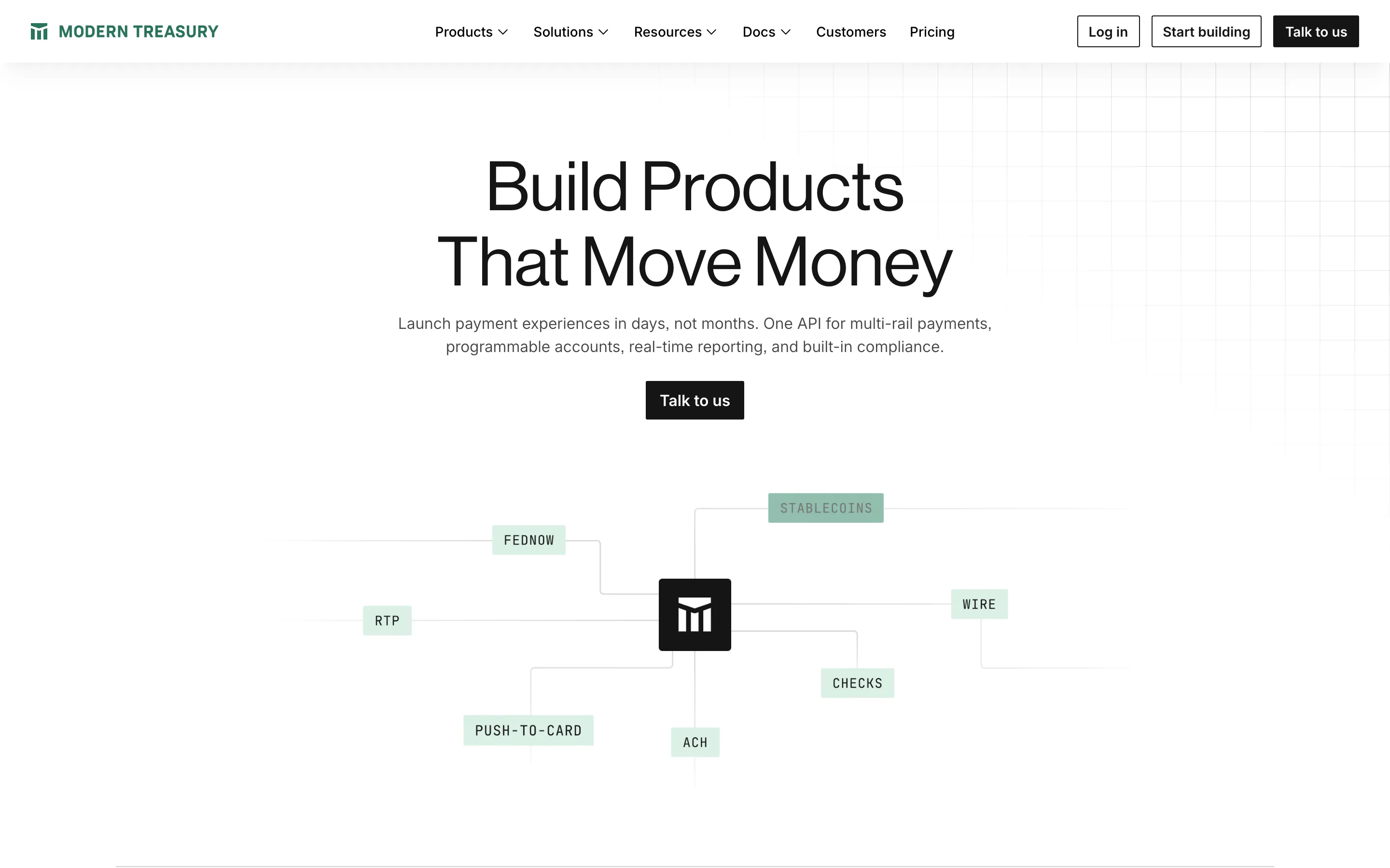
- **Modern Treasury** — ledger grid x payment rails (https://www.moderntreasury.com/). Screenshot: library/modern-treasury/hero.png
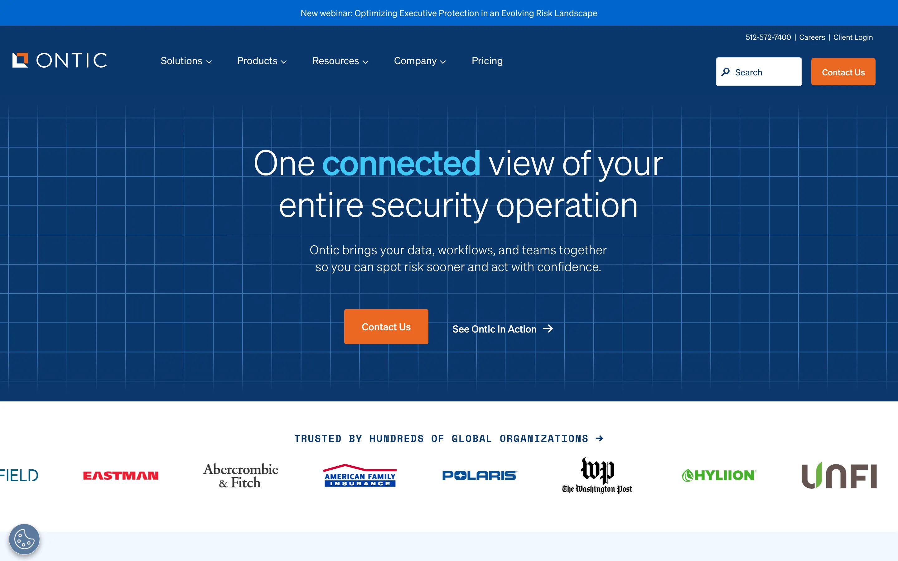
- **Ontic** — navy blueprint x mono labels (https://ontic.co/). Screenshot: library/ontic/hero.png
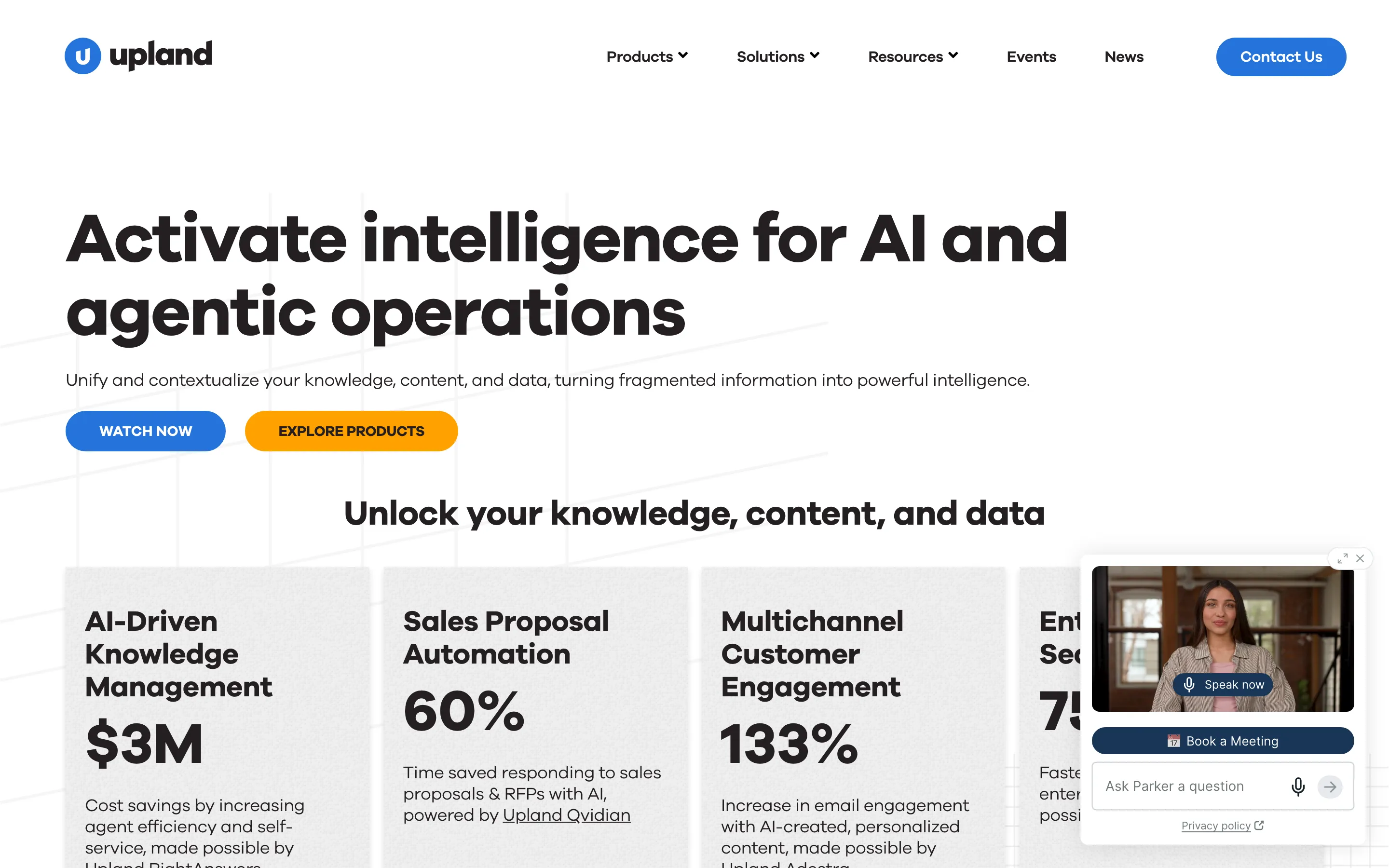
- **Upland Software** — geometric bold x graph paper (https://uplandsoftware.com/). Screenshot: library/upland/hero.png
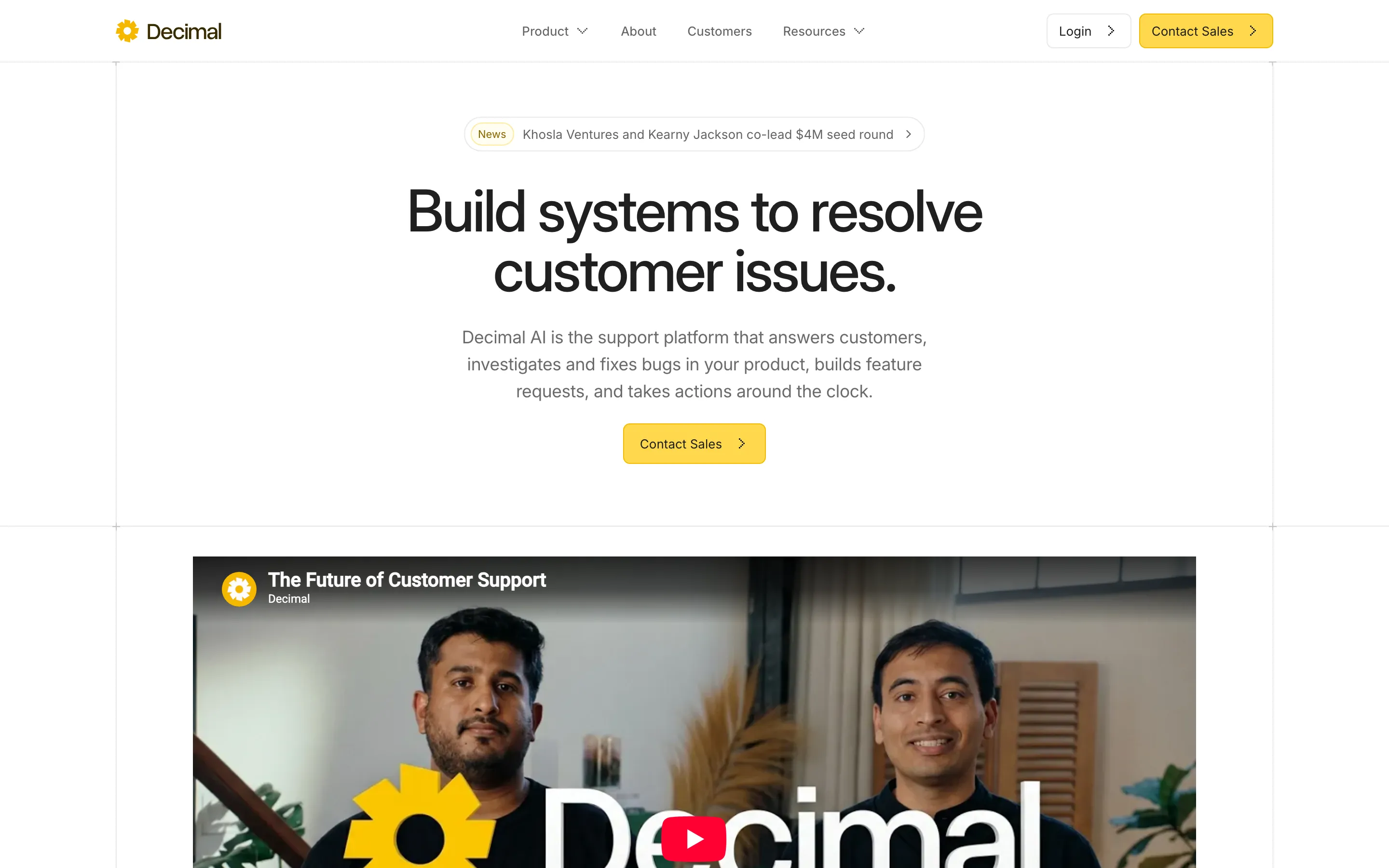
- **Decimal** — ruled frame x marigold button (https://www.decimal.app/). Screenshot: library/decimal/hero.png

## Reference files

- Site: https://fintechos.com/
- Hero screenshot: library/fintechos/hero.png
- Full-page screenshot: library/fintechos/full.png