# 1984 Ventures — DESIGN.md

> flat color blocks x gray annual report

**Aesthetic:** Swiss Block · **Mode:** persuade · **Color strategy:** full-palette · **Focus:** full · **Density:** comfortable
**Reference:** https://1984.vc/ (captured 2026-09-18)

Match the feel of this reference, not its content. Hexes and measurements are sampled from the page; type character, materials, and direction are interpreted from screenshots.

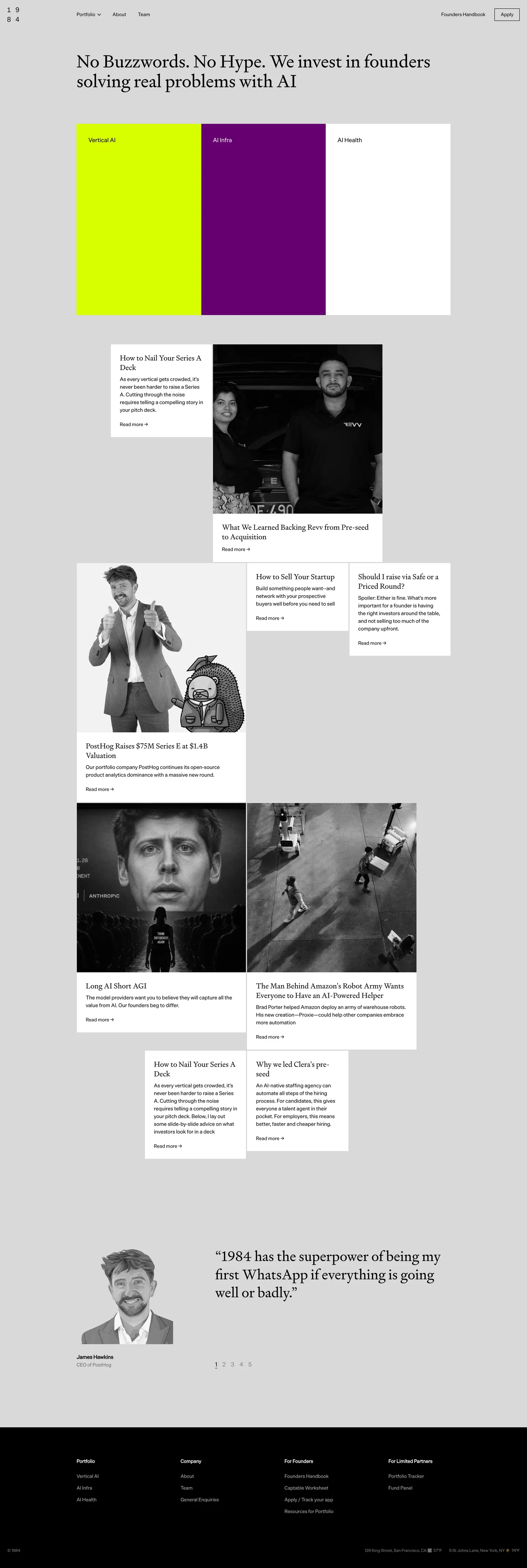
A venture fund homepage on flat light gray: a text serif headline, then three tall opaque blocks (acid yellow, plum, white) as the portfolio index, followed by a staggered grid of white cards and black-and-white photographs with no radius and no shadow anywhere.

## Colors

| Name | Hex | Role |
|---|---|---|
| Annual Gray | `#d9d9d9` | gray ground: The page ground everywhere, including behind cards; never tinted warm or cool. |
| Press Black | `#000000` | ink and footer: All text, the outlined Apply button, and the full-bleed footer band; the only dark value. |
| Acid Proof | `#d8ff00` | acid yellow block: The first vertical block only; never used for text, links, or buttons. |
| Plum Ink | `#66006f` | plum block: The second vertical block only, with white label text; never a gradient partner. |
| Sheet White | `#ffffff` | white block and cards: The third block and every article card; flat, borderless, no shadow. |

## Typography

- **Display:** Signifier (text serif) at 48px/54px regular, two lines, left-aligned; card titles Signifier 20px; the testimonial quote Signifier 40px
- **Body:** Die Grotesk A 14px/21px regular for excerpts
- **Labels:** Die Grotesk A 13-16px regular for nav and block labels; the wordmark is '1 9 / 8 4' as four spaced digits on two lines

### Type scale

| Role | Font | Size | Weight | Line height | Tracking | Case |
|---|---|---|---|---|---|---|
| display | Signifier | 48px | 400 | 54px | normal | — |
| card title | Signifier | 20px | 400 | 26px | normal | — |
| quote | Signifier | 40px | 400 | 50px | normal | — |
| body | Die Grotesk A | 14px | 400 | 21px | normal | — |
| nav | Die Grotesk A | 13px | 400 | 19.5px | normal | — |
| block label | Die Grotesk A | 16px | 400 | 24px | normal | — |
| footer heading | Die Grotesk A | 13px | 700 | 24px | normal | — |

## Spacing & shape

- **Density:** comfortable
- **Page max-width:** 1440px
- **Section gap:** 80-120px
- **Gutter:** 0px between blocks and cards; cards butt edge to edge
- **Elevation:** None. Depth comes only from white cards sitting on the gray ground; no shadows, no borders except the 1px black outline on Apply.

### Radius

- **buttons:** 0px
- **cards:** 0px
- **images:** 0px

## Materials

- flat light gray paper
- opaque acid yellow, plum, and white fields
- white cards with no border or shadow
- monochrome photography with duotone gray
- hairline-outlined rectangular button

## Signature details

- flat light gray ground
- three tall opaque color blocks
- acid yellow and plum pair
- text serif headline at left
- zero radius everywhere
- staggered card grid
- black-and-white portraits
- hairline outlined button
- stacked-digit wordmark
- near-black footer band

## Components

### Vertical Block Row
**Role:** Portfolio index and the page's color moment

Three equal-width flat rectangles butted edge to edge across the content column, roughly 330px tall: #d8ff00, #66006f, #ffffff. Each carries one Die Grotesk A 16px/400 label top-left at 24px inset (black on yellow and white, white on plum). No radius, shadow, border, image, or hover lift.

### Article Card
**Role:** Essay and portfolio-news teaser in the staggered grid

#ffffff fill, 0px radius, no border or shadow, ~24px padding. Signifier 20px/26px title in black, Die Grotesk A 14px/21px excerpt, then a 'Read more →' text link at 13px. Cards butt against photographs with no gap and sit at offset tops so the grid staggers.

### Monochrome Photo Tile
**Role:** Portraits and scenes between cards

Black-and-white or gray duotone photography, cropped square or portrait, 0px radius, butted directly to an adjacent white card that carries its caption. Never color photography.

### Outlined Apply Button
**Role:** The single primary action, top right

Transparent fill, 1px solid #000000 border, 0px radius, black Die Grotesk A 13px/400 label, about 8px 12px padding. The only bordered element on the page.

### Stacked-Digit Wordmark
**Role:** Brand mark, top left

The digits 1 9 / 8 4 set as a 2x2 grid in a monospace-like grotesk at ~14px, wide letterspacing, black. No logo shape, no color.

### Footer Band
**Role:** Site index on a full-bleed black ground

#000000 full-bleed band, four link columns with 13px/700 white headings and 13px/400 gray links, a bottom row with copyright left and office addresses with local weather right.

## Do's and Don'ts

### Do

- Keep every corner at 0px: blocks, cards, photos, and the Apply button
- Use Signifier at weight 400 for every headline and card title; let size, not weight, make hierarchy
- Let the three color blocks carry all the chroma on the page; everything else is gray, black, or white
- Butt cards and photos edge to edge and stagger their tops so the grid reads as a layout, not a feed
- Set all UI text (nav, labels, excerpts, footer) in Die Grotesk A at 13-16px, regular weight
- Convert all photography to black-and-white before placing it

### Don't

- Never add a shadow, border, or hover lift to a card; the white-on-gray value step is the only depth
- Never put acid yellow or plum on text, links, or buttons; they exist only as block fills
- Never bold a Signifier headline or set it above weight 400
- Never use a gradient, rounded corner, or icon set anywhere
- Never center the hero headline; it aligns to the left edge of the content column
- Never fill the Apply button; it stays a 1px black outline

## Direction

### THESIS

a fund with no buzzwords lays out its thesis as three flat blocks and a grid of plain cards; the design is the discipline. It refuses gradients, radius, and hero imagery.

### OWN-WORLD

light gray (#d9d9d9) ground; black ink; three opaque blocks in acid yellow (#d8ff00), plum (#66006f), and white sitting side by side at equal height with a label top-left in each; white cards and black-and-white photographs at zero radius with no shadow, arranged on a staggered 12-column grid; a black footer. Full-palette strategy with the blocks carrying it. Signifier serif for headlines and card titles; Die Grotesk A for nav, labels, and body.

### STORY

a founder reads the one-sentence thesis, sees the three verticals, browses essays and portfolio news, and applies.

### FIRST VIEWPORT

the stacked-digit wordmark top-left; Portfolio, About, Team nav; Founders Handbook and an outlined Apply button right; the headline at ~72px over two lines, left-aligned to the content column; three tall blocks filling the rest of the viewport, each labeled (Vertical AI, AI Infra, AI Health).

### FORM

a Swiss-grid annual report. Motion: not observed; blocks likely link to portfolio pages.

## Avoid

- Rounded corners, drop shadows, or a gradient anywhere collapses it into a generic card layout; the flatness is the style.
# 1984 Ventures — DESIGN.md

> flat color blocks x gray annual report

**Aesthetic:** Swiss Block · **Mode:** persuade · **Color strategy:** full-palette · **Focus:** full · **Density:** comfortable
**Reference:** https://1984.vc/ (captured 2026-09-18)

Match the feel of this reference, not its content. Hexes and measurements are sampled from the page; type character, materials, and direction are interpreted from screenshots.

A venture fund homepage on flat light gray: a text serif headline, then three tall opaque blocks (acid yellow, plum, white) as the portfolio index, followed by a staggered grid of white cards and black-and-white photographs with no radius and no shadow anywhere.

## Aesthetic — Swiss Block

Flat opaque color blocks on a neutral gray ground, arranged on a strict column grid with zero radius and no shadows; a text serif for headlines against a plain grotesk for labels; photography in black and white. The page reads as a printed annual report or a Swiss poster.

- **Vocabulary:** color block, gray ground, column grid, zero radius, text serif, black-and-white photography, tabular grid
- **Materials:** flat opaque color fields, neutral gray paper, hairline borders on white cards, monochrome photography
- **Color strategy:** full-palette

## Colors

| Name | Hex | Token | Role |
|---|---|---|---|
| Annual Gray | `#d9d9d9` | `--color-annual-gray` | gray ground: The page ground everywhere, including behind cards; never tinted warm or cool. |
| Press Black | `#000000` | `--color-press-black` | ink and footer: All text, the outlined Apply button, and the full-bleed footer band; the only dark value. |
| Acid Proof | `#d8ff00` | `--color-acid-proof` | acid yellow block: The first vertical block only; never used for text, links, or buttons. |
| Plum Ink | `#66006f` | `--color-plum-ink` | plum block: The second vertical block only, with white label text; never a gradient partner. |
| Sheet White | `#ffffff` | `--color-sheet-white` | white block and cards: The third block and every article card; flat, borderless, no shadow. |

## Typography

- **Display:** Signifier (text serif) at 48px/54px regular, two lines, left-aligned; card titles Signifier 20px; the testimonial quote Signifier 40px
- **Body:** Die Grotesk A 14px/21px regular for excerpts
- **Labels:** Die Grotesk A 13-16px regular for nav and block labels; the wordmark is '1 9 / 8 4' as four spaced digits on two lines
- **Detected fonts:** Signifier, Die Grotesk A, Die Grotesk B, Atlas Typewriter

### Type scale

| Role | Font | Size | Weight | Line height | Tracking | Case |
|---|---|---|---|---|---|---|
| display | Signifier | 48px | 400 | 54px | normal | — |
| card title | Signifier | 20px | 400 | 26px | normal | — |
| quote | Signifier | 40px | 400 | 50px | normal | — |
| body | Die Grotesk A | 14px | 400 | 21px | normal | — |
| nav | Die Grotesk A | 13px | 400 | 19.5px | normal | — |
| block label | Die Grotesk A | 16px | 400 | 24px | normal | — |
| footer heading | Die Grotesk A | 13px | 700 | 24px | normal | — |

## Spacing & shape

- **Density:** comfortable
- **Page max-width:** 1440px
- **Section gap:** 80-120px
- **Gutter:** 0px between blocks and cards; cards butt edge to edge
- **Elevation:** None. Depth comes only from white cards sitting on the gray ground; no shadows, no borders except the 1px black outline on Apply.

### Radius

- **buttons:** 0px
- **cards:** 0px
- **images:** 0px

## Materials

- flat light gray paper
- opaque acid yellow, plum, and white fields
- white cards with no border or shadow
- monochrome photography with duotone gray
- hairline-outlined rectangular button

## Signature details

- flat light gray ground
- three tall opaque color blocks
- acid yellow and plum pair
- text serif headline at left
- zero radius everywhere
- staggered card grid
- black-and-white portraits
- hairline outlined button
- stacked-digit wordmark
- near-black footer band

## Components

### Vertical Block Row
**Role:** Portfolio index and the page's color moment

Three equal-width flat rectangles butted edge to edge across the content column, roughly 330px tall: #d8ff00, #66006f, #ffffff. Each carries one Die Grotesk A 16px/400 label top-left at 24px inset (black on yellow and white, white on plum). No radius, shadow, border, image, or hover lift.

### Article Card
**Role:** Essay and portfolio-news teaser in the staggered grid

#ffffff fill, 0px radius, no border or shadow, ~24px padding. Signifier 20px/26px title in black, Die Grotesk A 14px/21px excerpt, then a 'Read more →' text link at 13px. Cards butt against photographs with no gap and sit at offset tops so the grid staggers.

### Monochrome Photo Tile
**Role:** Portraits and scenes between cards

Black-and-white or gray duotone photography, cropped square or portrait, 0px radius, butted directly to an adjacent white card that carries its caption. Never color photography.

### Outlined Apply Button
**Role:** The single primary action, top right

Transparent fill, 1px solid #000000 border, 0px radius, black Die Grotesk A 13px/400 label, about 8px 12px padding. The only bordered element on the page.

### Stacked-Digit Wordmark
**Role:** Brand mark, top left

The digits 1 9 / 8 4 set as a 2x2 grid in a monospace-like grotesk at ~14px, wide letterspacing, black. No logo shape, no color.

### Footer Band
**Role:** Site index on a full-bleed black ground

#000000 full-bleed band, four link columns with 13px/700 white headings and 13px/400 gray links, a bottom row with copyright left and office addresses with local weather right.

## Do's and Don'ts

### Do

- Keep every corner at 0px: blocks, cards, photos, and the Apply button
- Use Signifier at weight 400 for every headline and card title; let size, not weight, make hierarchy
- Let the three color blocks carry all the chroma on the page; everything else is gray, black, or white
- Butt cards and photos edge to edge and stagger their tops so the grid reads as a layout, not a feed
- Set all UI text (nav, labels, excerpts, footer) in Die Grotesk A at 13-16px, regular weight
- Convert all photography to black-and-white before placing it

### Don't

- Never add a shadow, border, or hover lift to a card; the white-on-gray value step is the only depth
- Never put acid yellow or plum on text, links, or buttons; they exist only as block fills
- Never bold a Signifier headline or set it above weight 400
- Never use a gradient, rounded corner, or icon set anywhere
- Never center the hero headline; it aligns to the left edge of the content column
- Never fill the Apply button; it stays a 1px black outline

## Direction

### THESIS

a fund with no buzzwords lays out its thesis as three flat blocks and a grid of plain cards; the design is the discipline. It refuses gradients, radius, and hero imagery.

### OWN-WORLD

light gray (#d9d9d9) ground; black ink; three opaque blocks in acid yellow (#d8ff00), plum (#66006f), and white sitting side by side at equal height with a label top-left in each; white cards and black-and-white photographs at zero radius with no shadow, arranged on a staggered 12-column grid; a black footer. Full-palette strategy with the blocks carrying it. Signifier serif for headlines and card titles; Die Grotesk A for nav, labels, and body.

### STORY

a founder reads the one-sentence thesis, sees the three verticals, browses essays and portfolio news, and applies.

### FIRST VIEWPORT

the stacked-digit wordmark top-left; Portfolio, About, Team nav; Founders Handbook and an outlined Apply button right; the headline at ~72px over two lines, left-aligned to the content column; three tall blocks filling the rest of the viewport, each labeled (Vertical AI, AI Infra, AI Health).

### FORM

a Swiss-grid annual report. Motion: not observed; blocks likely link to portfolio pages.

## Hero image prompt

Replace the `[SUBJECT]` with your own subject, then send to Higgsfield gpt_image_2 @ 2K.

```text
[SUBJECT: three tall vertical rectangles side by side] as perfectly flat opaque fields in acid yellow (#d8ff00), deep plum (#66006f), and white, on a flat light gray (#d9d9d9) ground, equal widths, hard edges, no radius, no shadow, no gradient, no text, wide landscape frame with a gray band above the blocks
```

## Avoid

- Rounded corners, drop shadows, or a gradient anywhere collapses it into a generic card layout; the flatness is the style.

## Guardrails

### Always
- Commit to one visual world per page; one hand made everything.
- Real content and real product truth. No invented customers, prices, or benchmarks.
- A visible primary action within the first viewport on persuade surfaces.
- Type set with intent: a display face with a point of view, sizes from a scale, tabular numerals for data.
- Motion with weight: staggered reveals, long easing, nothing bouncy.
- Transitions between hero and body that feel designed, not a hard cut.

### Never
- Purple or blue-purple gradients, glowing edges, "3D SaaS blobs".
- Inter (or any default system grotesk) as the display face.
- The AI default clusters unless the brief pins them: cream ground + high-contrast serif + terracotta accent; near-black + one neon accent; broadsheet hairlines + italic serif + tracked mono labels.
- Generic feature grids of three icon cards.
- Stock illustration mixed with photography.
- Emoji as icons.
- Centered-everything layouts with no reading order.

## Quick start

### CSS custom properties

```css
:root {
  /* Colors */
  --color-annual-gray: #d9d9d9;
  --color-press-black: #000000;
  --color-acid-proof: #d8ff00;
  --color-plum-ink: #66006f;
  --color-sheet-white: #ffffff;

  /* Fonts */
  --font-signifier: 'Signifier';
  --font-die-grotesk-a: 'Die Grotesk A';

  /* Type scale */
  --text-display: 48px;
  --text-display--line-height: 54px;
  --text-display--font-weight: 400;
  --text-card-title: 20px;
  --text-card-title--line-height: 26px;
  --text-card-title--font-weight: 400;
  --text-quote: 40px;
  --text-quote--line-height: 50px;
  --text-quote--font-weight: 400;
  --text-body: 14px;
  --text-body--line-height: 21px;
  --text-body--font-weight: 400;
  --text-nav: 13px;
  --text-nav--line-height: 19.5px;
  --text-nav--font-weight: 400;
  --text-block-label: 16px;
  --text-block-label--line-height: 24px;
  --text-block-label--font-weight: 400;
  --text-footer-heading: 13px;
  --text-footer-heading--line-height: 24px;
  --text-footer-heading--font-weight: 700;

  /* Radius */
  --radius-buttons: 0px;
  --radius-cards: 0px;
  --radius-images: 0px;

  /* Layout */
  --page-max-width: 1440px;
  --section-gap: 80-120px;
  --gutter: 0px between blocks and cards; cards butt edge to edge;
}
```

### Tailwind v4

```css
@theme {
  /* Colors */
  --color-annual-gray: #d9d9d9;
  --color-press-black: #000000;
  --color-acid-proof: #d8ff00;
  --color-plum-ink: #66006f;
  --color-sheet-white: #ffffff;

  /* Fonts */
  --font-signifier: 'Signifier';
  --font-die-grotesk-a: 'Die Grotesk A';

  /* Type scale */
  --text-display: 48px;
  --text-display--line-height: 54px;
  --text-display--font-weight: 400;
  --text-card-title: 20px;
  --text-card-title--line-height: 26px;
  --text-card-title--font-weight: 400;
  --text-quote: 40px;
  --text-quote--line-height: 50px;
  --text-quote--font-weight: 400;
  --text-body: 14px;
  --text-body--line-height: 21px;
  --text-body--font-weight: 400;
  --text-nav: 13px;
  --text-nav--line-height: 19.5px;
  --text-nav--font-weight: 400;
  --text-block-label: 16px;
  --text-block-label--line-height: 24px;
  --text-block-label--font-weight: 400;
  --text-footer-heading: 13px;
  --text-footer-heading--line-height: 24px;
  --text-footer-heading--font-weight: 700;

  /* Radius */
  --radius-buttons: 0px;
  --radius-cards: 0px;
  --radius-images: 0px;
}
```

### Extracted from the live site

```css
--type-h1: 400 48px/54px Signifier;
--type-body: 400 16px/24px Die Grotesk A;
```

## Similar in the library

- **FintechOS** — portrait cutout x product blueprint (https://fintechos.com/). Screenshot: library/fintechos/hero.png
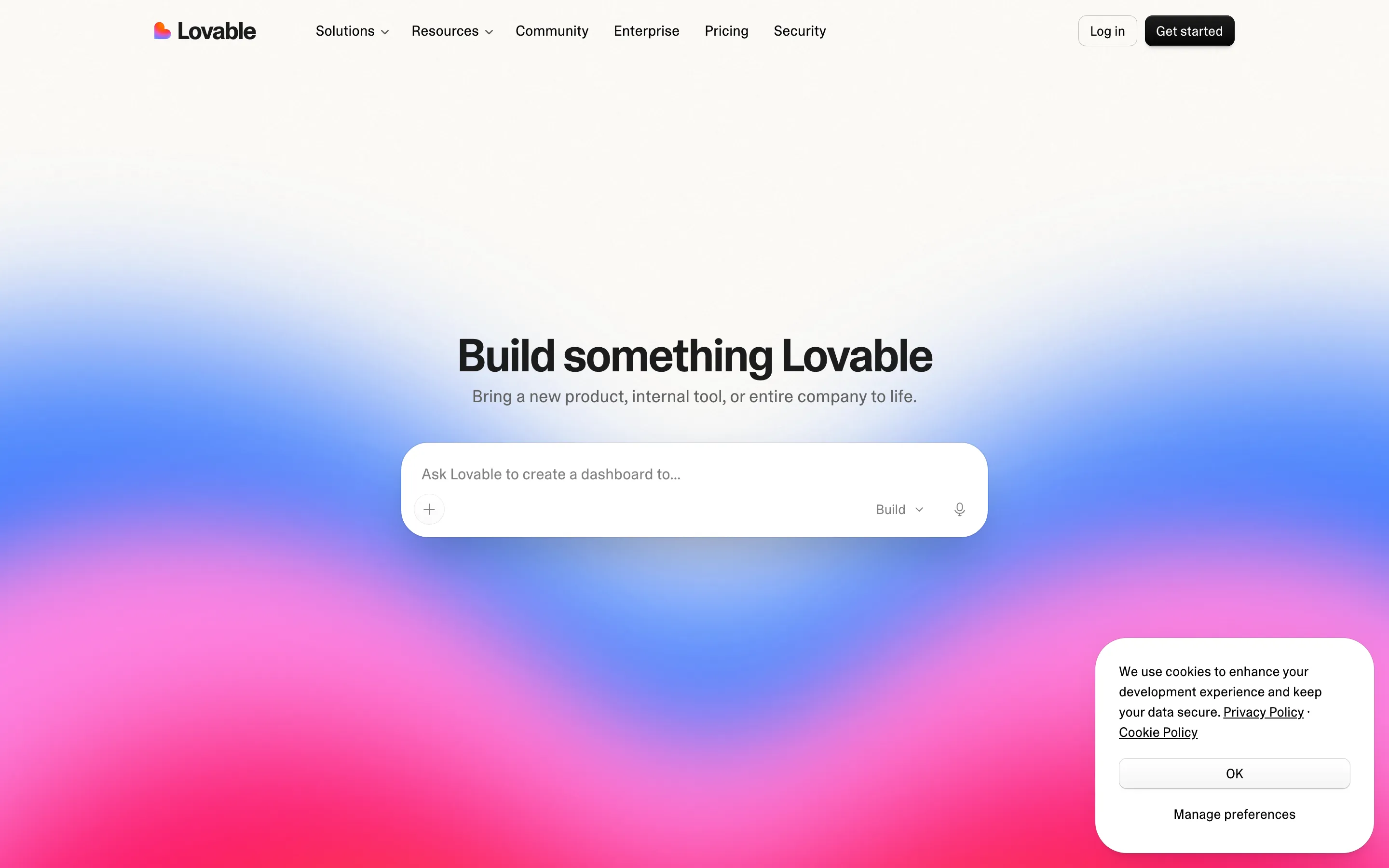
- **Lovable** — prompt box x sunset gradient (https://lovable.dev/). Screenshot: library/lovable/hero.png
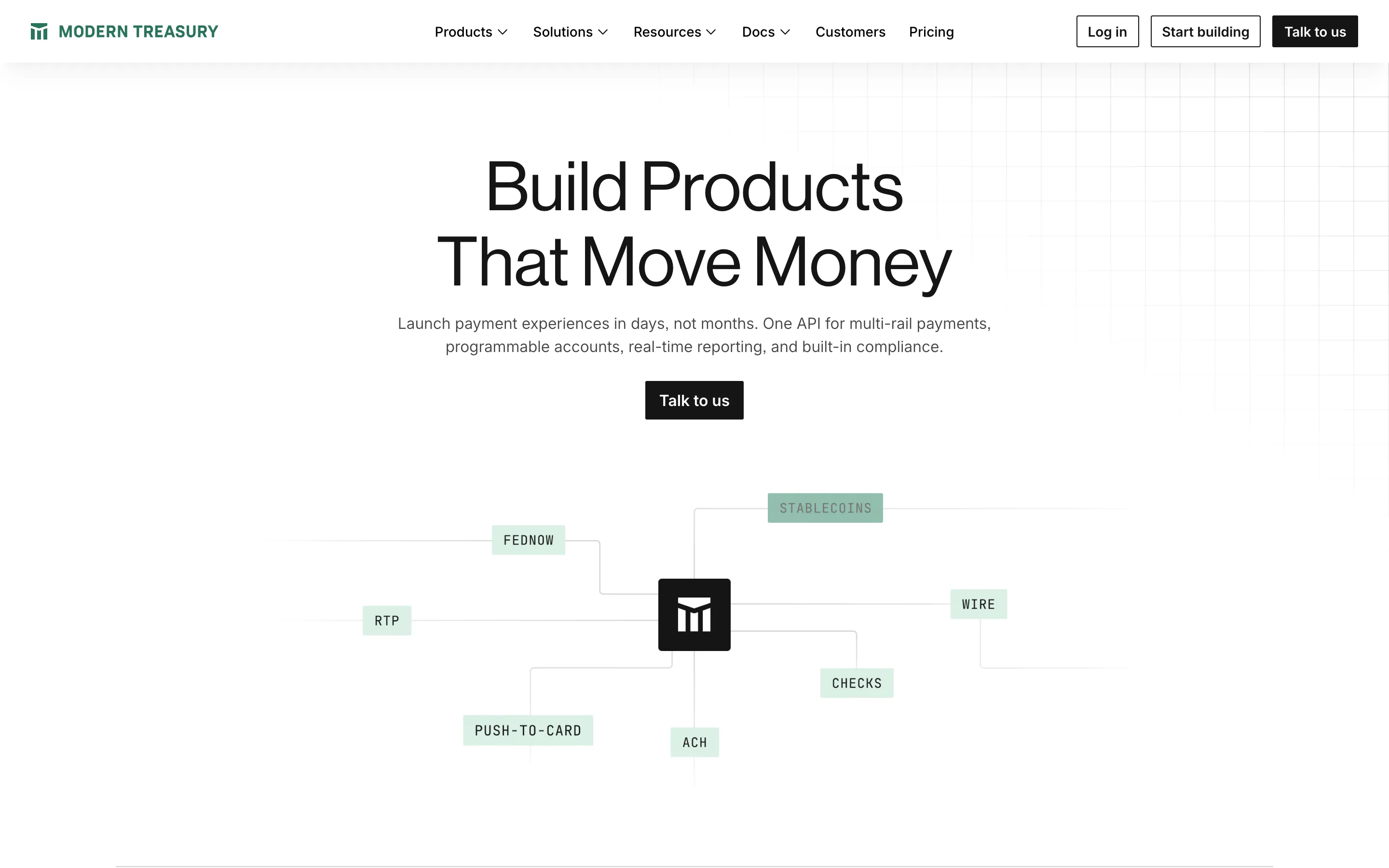
- **Modern Treasury** — ledger grid x payment rails (https://www.moderntreasury.com/). Screenshot: library/modern-treasury/hero.png
- **Reach Church Archive** — family cutout x playful shapes (https://reach-archive.webflow.io/). Screenshot: library/reach-archive/hero.png

## Reference files

- Site: https://1984.vc/
- Hero screenshot: library/1984/hero.png
- Full-page screenshot: library/1984/full.png