
# Calendly — DESIGN.md

> blue keynote x product carousel

**Aesthetic:** Product Keynote · **Mode:** persuade · **Color strategy:** drenched · **Focus:** hero
**Reference:** https://calendly.com/ (captured 2026-09-18)

Match the feel of this reference, not its content. Hexes and measurements are sampled from the page; type character, materials, and direction are interpreted from screenshots.

A broad blue-to-pink stage carries one oversized scheduling promise, direct account actions, and a white product carousel that makes four related tools feel like one consumer suite.

## Colors

| Hex | Role |
|---|---|
| `#071a31` | navigation ink |
| `#3f82d4` | hero field |
| `#d68ce9` | gradient edge |
| `#fcfbf8` | page and card ground |
| `#dff26a` | active product signal |

## Typography

- **Display:** Calendly Sans at ~72px bold, centered, two lines with tight leading
- **Body:** Geist at ~18px regular, centered
- **Labels:** Geist medium at 14–16px inside outlined and filled rounded controls

## Materials

- blue-lilac gradient field
- warm white cards
- dark navy buttons
- outlined icon medallions
- soft product illustration panels

## Signature details

- blue gradient stage
- oversized white headline
- rounded product theater
- identity provider buttons
- icon carousel selector
- white product card
- announcement ribbon

## Direction

### THESIS

the work around a meeting is one continuous product, presented with the confidence of a consumer keynote. It refuses a scattered feature-card grid in the first viewport.

### OWN-WORLD

a white navigation shell above a deeply saturated blue field that drifts toward lilac and pink at the lower-right edge. Use navy #071a31 for controls, warm white #fcfbf8 for type and cards, and sharp lime only for the active tool. Set everything in Calendly Sans and Geist. Corners are large enough to make the hero a single contained theater. Product selectors are outlined circular medallions, and product demonstrations live inside broad white cards.

### STORY

visitors understand the unified promise, choose a familiar identity provider, then move among scheduling, assistant, notes, and payments without leaving the stage.

### FIRST VIEWPORT

run a slim blue announcement strip, then a white nav with logo left and three actions right. Below, inset one almost-full-width gradient panel with a two-line white headline centered high, a short lead, two dark signup buttons, and a text signup link. Place the four-tool selector beneath; let a huge white demonstration card enter from the bottom edge.

### FORM

a keynote slide built as an interactive product carousel. Motion: the active medallion and demonstration panel may switch with a measured crossfade; the background remains still.

## Avoid

- Blue-purple gradient panels plus Inter is the saas-gradient cluster; this world survives only when the product UI inside the devices is the star and the gradient is one color, not two.
- Drifting into the `saas-gradient (blue-lilac gradient, rounded white product cards, and sans display; scale and suite-level carousel execution carry it)` AI-default cluster; this reference sits near it, so keep the details that separate it.
# Calendly — DESIGN.md

> blue keynote x product carousel

**Aesthetic:** Product Keynote · **Mode:** persuade · **Color strategy:** drenched · **Focus:** hero
**Reference:** https://calendly.com/ (captured 2026-09-18)

Match the feel of this reference, not its content. Hexes and measurements are sampled from the page; type character, materials, and direction are interpreted from screenshots.

A broad blue-to-pink stage carries one oversized scheduling promise, direct account actions, and a white product carousel that makes four related tools feel like one consumer suite.

## Aesthetic — Product Keynote

Consumer and developer product marketing in the Apple keynote register: a heavy grotesk headline centered on a light gray or white ground, device mockups (phone, laptop, browser) as the only imagery, pill buttons, and soft colored gradient panels behind the devices. Sections are one claim plus one picture.

- **Vocabulary:** device mockup, keynote headline, pill button, gradient panel, glass nav, feature tile, one claim one picture
- **Materials:** light gray or white ground, phone and laptop frames, soft two-tone gradient panels, frosted nav bar
- **Color strategy:** restrained

## Colors

| Hex | Token | Role |
|---|---|---|
| `#071a31` | `--color-navigation-ink` | navigation ink |
| `#3f82d4` | `--color-hero-field` | hero field |
| `#d68ce9` | `--color-gradient-edge` | gradient edge |
| `#fcfbf8` | `--color-page-and-card-ground` | page and card ground |
| `#dff26a` | `--color-active-product-signal` | active product signal |

## Typography

- **Display:** Calendly Sans at ~72px bold, centered, two lines with tight leading
- **Body:** Geist at ~18px regular, centered
- **Labels:** Geist medium at 14–16px inside outlined and filled rounded controls
- **Detected fonts:** Geist, Calendly Sans, Wulkan Text

## Materials

- blue-lilac gradient field
- warm white cards
- dark navy buttons
- outlined icon medallions
- soft product illustration panels

## Signature details

- blue gradient stage
- oversized white headline
- rounded product theater
- identity provider buttons
- icon carousel selector
- white product card
- announcement ribbon

## Direction

### THESIS

the work around a meeting is one continuous product, presented with the confidence of a consumer keynote. It refuses a scattered feature-card grid in the first viewport.

### OWN-WORLD

a white navigation shell above a deeply saturated blue field that drifts toward lilac and pink at the lower-right edge. Use navy #071a31 for controls, warm white #fcfbf8 for type and cards, and sharp lime only for the active tool. Set everything in Calendly Sans and Geist. Corners are large enough to make the hero a single contained theater. Product selectors are outlined circular medallions, and product demonstrations live inside broad white cards.

### STORY

visitors understand the unified promise, choose a familiar identity provider, then move among scheduling, assistant, notes, and payments without leaving the stage.

### FIRST VIEWPORT

run a slim blue announcement strip, then a white nav with logo left and three actions right. Below, inset one almost-full-width gradient panel with a two-line white headline centered high, a short lead, two dark signup buttons, and a text signup link. Place the four-tool selector beneath; let a huge white demonstration card enter from the bottom edge.

### FORM

a keynote slide built as an interactive product carousel. Motion: the active medallion and demonstration panel may switch with a measured crossfade; the background remains still.

## Hero image prompt

Replace the `[SUBJECT]` with your own subject, then send to Higgsfield gpt_image_2 @ 2K.

```text
[SUBJECT: a scheduling assistant represented by a calendar card, meeting recap, and payment tile] rendered as soft consumer-product UI inside one large warm-white rounded panel, saturated blue-to-lilac field behind it, navy controls, one acid-lime active marker, diffuse studio light, straight-on framing, no text, wide landscape composition
```

## Avoid

- Blue-purple gradient panels plus Inter is the saas-gradient cluster; this world survives only when the product UI inside the devices is the star and the gradient is one color, not two.
- Drifting into the `saas-gradient (blue-lilac gradient, rounded white product cards, and sans display; scale and suite-level carousel execution carry it)` AI-default cluster; this reference sits near it, so keep the details that separate it.

## Guardrails

### Always
- Commit to one visual world per page; one hand made everything.
- Real content and real product truth. No invented customers, prices, or benchmarks.
- A visible primary action within the first viewport on persuade surfaces.
- Type set with intent: a display face with a point of view, sizes from a scale, tabular numerals for data.
- Motion with weight: staggered reveals, long easing, nothing bouncy.
- Transitions between hero and body that feel designed, not a hard cut.

### Never
- Purple or blue-purple gradients, glowing edges, "3D SaaS blobs".
- Inter (or any default system grotesk) as the display face.
- The AI default clusters unless the brief pins them: cream ground + high-contrast serif + terracotta accent; near-black + one neon accent; broadsheet hairlines + italic serif + tracked mono labels.
- Generic feature grids of three icon cards.
- Stock illustration mixed with photography.
- Emoji as icons.
- Centered-everything layouts with no reading order.

## Quick start

### CSS custom properties

```css
:root {
  /* Colors */
  --color-navigation-ink: #071a31;
  --color-hero-field: #3f82d4;
  --color-gradient-edge: #d68ce9;
  --color-page-and-card-ground: #fcfbf8;
  --color-active-product-signal: #dff26a;
}
```

### Tailwind v4

```css
@theme {
  /* Colors */
  --color-navigation-ink: #071a31;
  --color-hero-field: #3f82d4;
  --color-gradient-edge: #d68ce9;
  --color-page-and-card-ground: #fcfbf8;
  --color-active-product-signal: #dff26a;
}
```

### Extracted from the live site

```css
--section-rounded-divider-height: calc(.25rem*8);
--spacing-section-default: calc(.25rem*30);
--layout-max-width: 1920px;
--header-height: 108px;
```

## Similar in the library

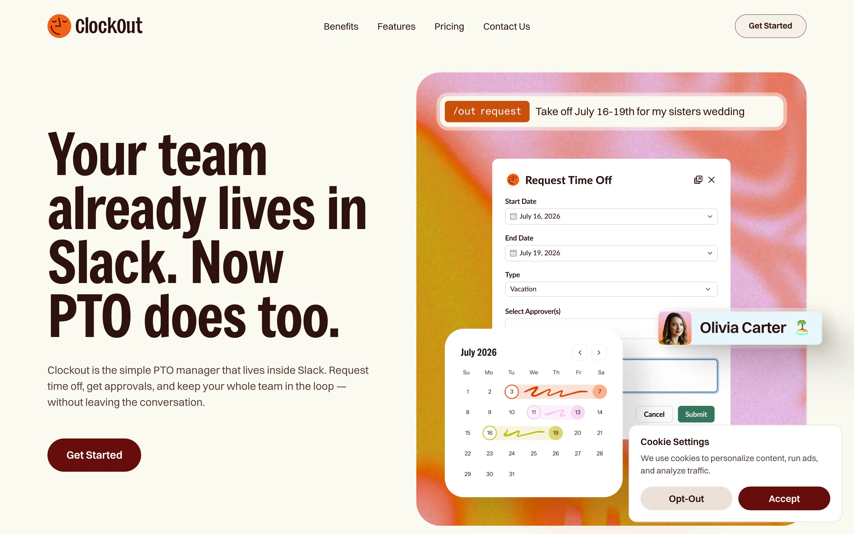
- **Clockout** — oxblood poster type x clay vacation (https://goclockout.app/). Screenshot: library/clockout/hero.png
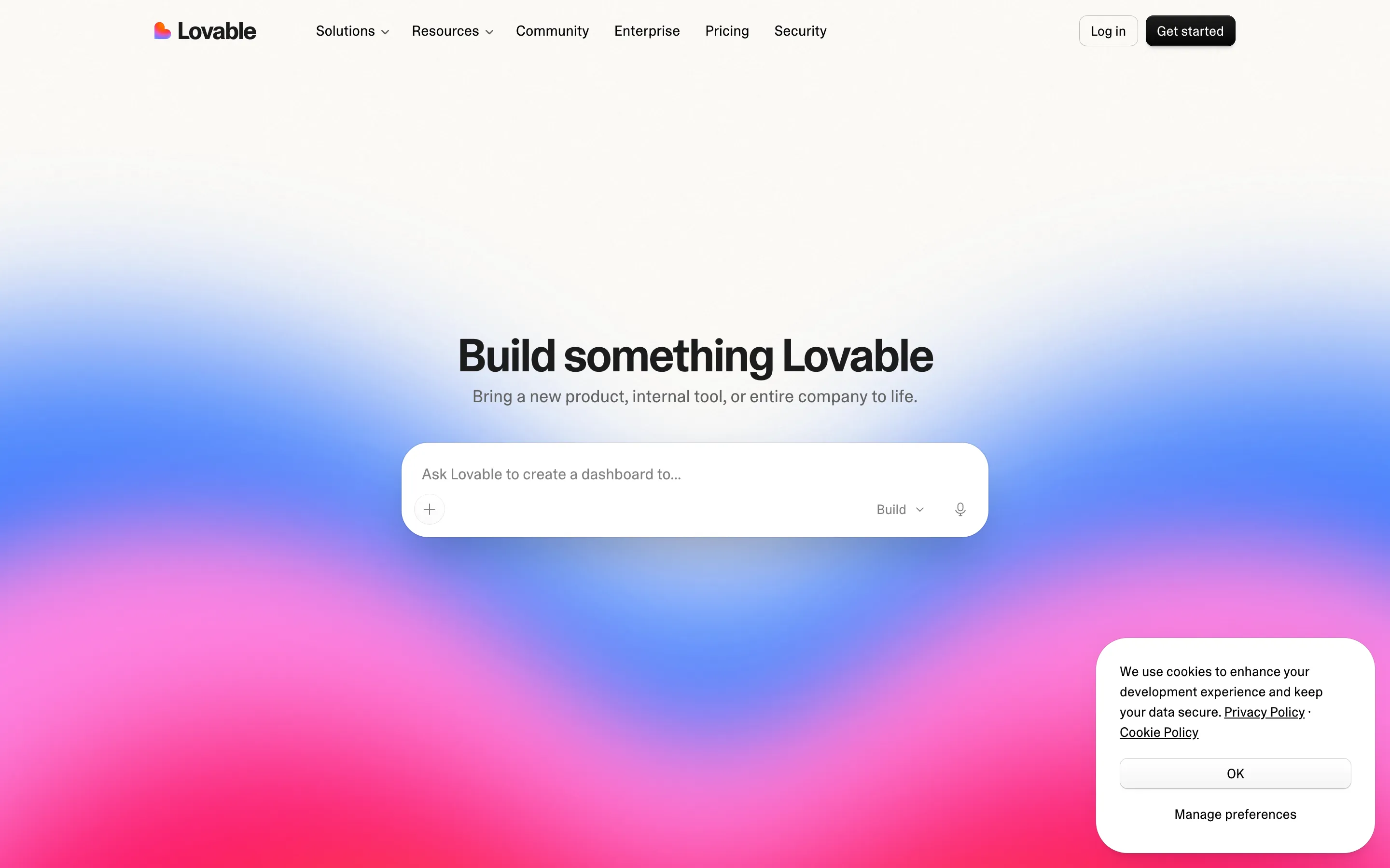
- **Lovable** — prompt box x sunset gradient (https://lovable.dev/). Screenshot: library/lovable/hero.png
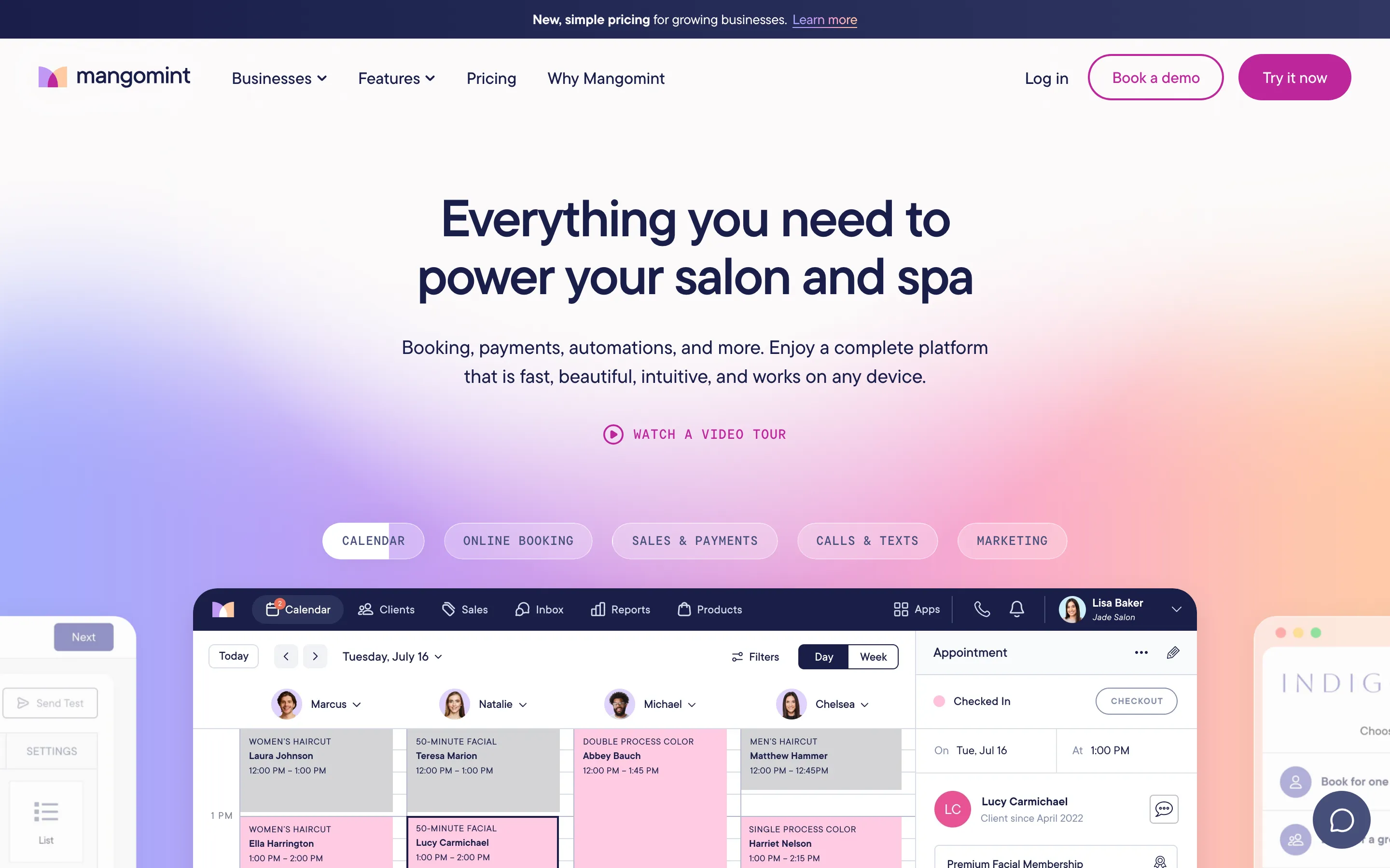
- **Mangomint** — salon blush x scheduling grid (https://www.mangomint.com/). Screenshot: library/mangomint/hero.png
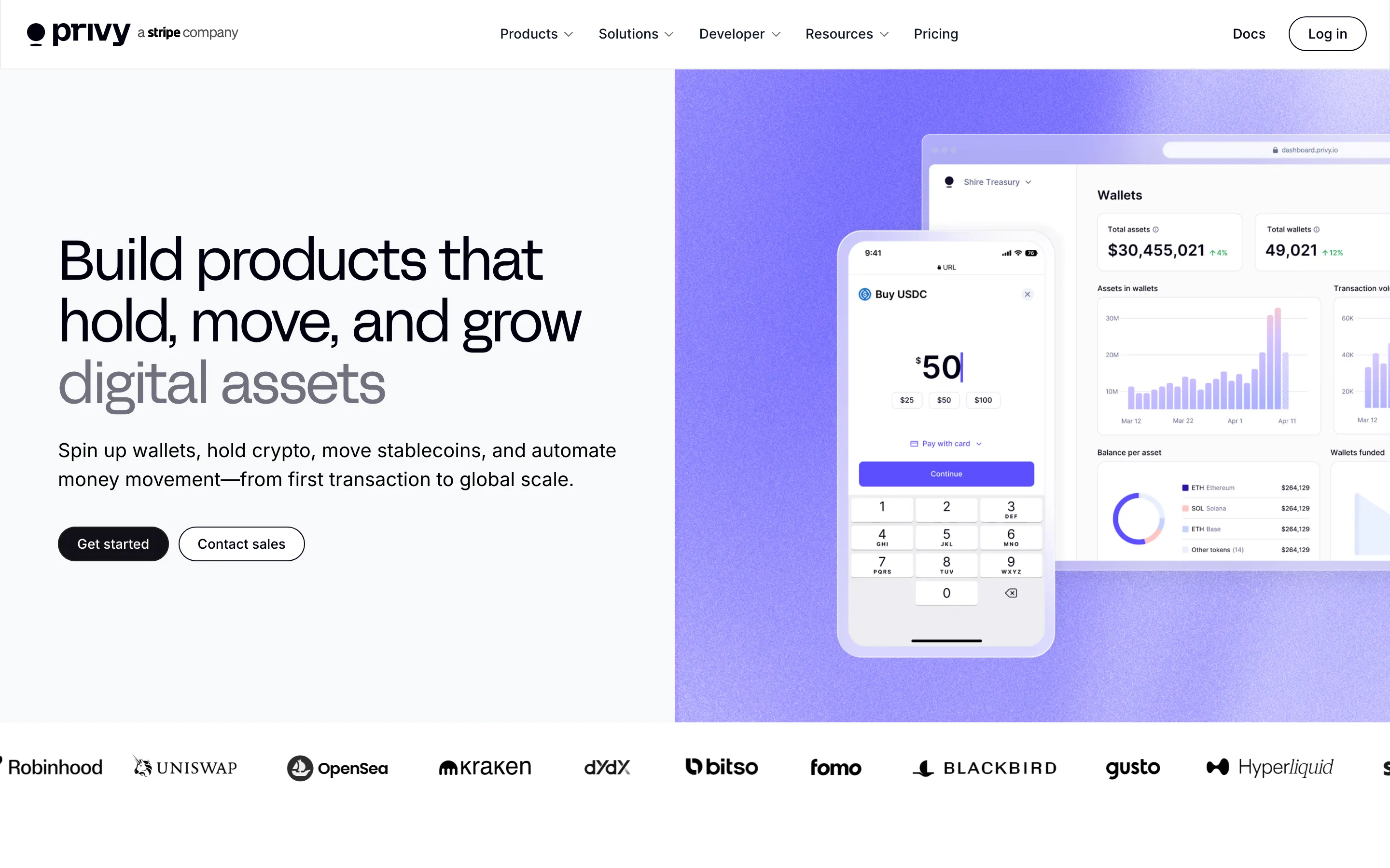
- **Privy** — grotesk keynote x lavender product panel (https://www.privy.io/). Screenshot: library/privy/hero.png

## Reference files

- Site: https://calendly.com/
- Hero screenshot: library/calendly/hero.png
- Full-page screenshot: library/calendly/full.png