
# Clockout — DESIGN.md

> oxblood poster type x clay vacation

**Aesthetic:** Product Keynote · **Mode:** persuade · **Color strategy:** committed · **Focus:** hero
**Reference:** https://goclockout.app/ (captured 2026-10-07)

Match the feel of this reference, not its content. Hexes and measurements are sampled from the page; type character, materials, and direction are interpreted from screenshots.

A towering condensed oxblood headline on warm cream sits beside a grainy coral-and-orchid gradient panel stacked with floating Slack UI cards, and soft 3D clay icons carry the warmth down the page, so a PTO tool reads like a holiday postcard.

## Colors

| Hex | Role |
|---|---|
| `#fbf9f1` | ground |
| `#2d110f` | headline ink |
| `#670d0c` | primary button and wordmark |
| `#f16215` | logo, chip, and gradient hot spot |
| `#f2c7f2` | gradient orchid and card tint |
| `#c3be16` | chartreuse secondary accent |
| `#f5f0e8` | card panel |

## Typography

- **Display:** Freeman, a heavy condensed grotesk, at ~140px, sentence case, tight leading, deep oxblood, left-set over four lines
- **Body:** Switzer at ~22px regular in warm brown-gray, left-set at a medium measure
- **Labels:** Switzer ~18px medium for nav and buttons; mono for the slash-command chip

## Materials

- warm cream ground
- grainy blurred gradient
- white UI cards with soft shadows
- matte 3D clay icons
- hand-drawn marker strokes

## Signature details

- condensed oxblood display headline
- grainy coral orchid gradient panel
- floating stacked UI cards
- scribbled calendar range strokes
- 3D clay emoji icons
- slash command chip
- avatar status pill
- stacked leave-type word list

## Direction

### THESIS

time off should feel like a holiday, so the page is warm, loud, and tactile while the product stays plain Slack UI. It refuses blue SaaS gradients, isometric illustration, and dashboard screenshots.

### OWN-WORLD

warm cream ground (#fbf9f1), headlines in Freeman, a heavy condensed grotesk set huge and tight in near-black oxblood (#2d110f). Primary buttons are deep oxblood (#670d0c) pills; secondary is an outlined pill. Imagery is a rounded panel of grainy blurred gradient, orange (#f16215) bleeding into orchid (#f2c7f2) and mustard, with white form and calendar cards floating on it. Calendar ranges are drawn with marker scribbles in orange, orchid, and chartreuse (#c3be16). Icons are soft 3D clay objects (palm tree, heart, smiley, money) on rounded square tiles. Feature cards are cream (#f5f0e8) tiles with a clay icon, bold title, and short text.

### STORY

the visitor sees a request typed as a slash command, watches it become an approval, scrolls a giant stacked list of leave types, reads three benefits, a six-tile feature grid, one simple price, FAQs, and a closing CTA with a clay calendar.

### FIRST VIEWPORT

wordmark left with an orange smiley logo, four links center, outlined Get Started pill right. Left half: a four-line condensed headline filling about 45% of the width, a three-line body, and an oxblood pill. Right half: the gradient panel from below the nav to the fold, a /out request chip at top, a Request Time Off form card, an overlapping calendar card, and an avatar status pill breaking the panel edge.

### FORM

a vacation postcard with a Slack screenshot pasted on. Motion grammar: not observed beyond cards that likely drift and clay icons scattered around the scroll.

## Avoid

- Blue-purple gradient panels plus Inter is the saas-gradient cluster; this world survives only when the product UI inside the devices is the star and the gradient is one color, not two.
- Drifting into the `warm-cream-serif-terracotta (adjacent: cream ground with warm orange; it swaps the serif for a condensed poster grotesk and adds orchid and chartreuse)` AI-default cluster; this reference sits near it, so keep the details that separate it.
# Clockout — DESIGN.md

> oxblood poster type x clay vacation

**Aesthetic:** Product Keynote · **Mode:** persuade · **Color strategy:** committed · **Focus:** hero
**Reference:** https://goclockout.app/ (captured 2026-10-07)

Match the feel of this reference, not its content. Hexes and measurements are sampled from the page; type character, materials, and direction are interpreted from screenshots.

A towering condensed oxblood headline on warm cream sits beside a grainy coral-and-orchid gradient panel stacked with floating Slack UI cards, and soft 3D clay icons carry the warmth down the page, so a PTO tool reads like a holiday postcard.

## Aesthetic — Product Keynote

Consumer and developer product marketing in the Apple keynote register: a heavy grotesk headline centered on a light gray or white ground, device mockups (phone, laptop, browser) as the only imagery, pill buttons, and soft colored gradient panels behind the devices. Sections are one claim plus one picture.

- **Vocabulary:** device mockup, keynote headline, pill button, gradient panel, glass nav, feature tile, one claim one picture
- **Materials:** light gray or white ground, phone and laptop frames, soft two-tone gradient panels, frosted nav bar
- **Color strategy:** restrained

## Colors

| Hex | Token | Role |
|---|---|---|
| `#fbf9f1` | `--color-ground` | ground |
| `#2d110f` | `--color-headline-ink` | headline ink |
| `#670d0c` | `--color-primary-button-and-wordmark` | primary button and wordmark |
| `#f16215` | `--color-logo-chip-and-gradient-hot-spot` | logo, chip, and gradient hot spot |
| `#f2c7f2` | `--color-gradient-orchid-and-card-tint` | gradient orchid and card tint |
| `#c3be16` | `--color-chartreuse-secondary-accent` | chartreuse secondary accent |
| `#f5f0e8` | `--color-card-panel` | card panel |

## Typography

- **Display:** Freeman, a heavy condensed grotesk, at ~140px, sentence case, tight leading, deep oxblood, left-set over four lines
- **Body:** Switzer at ~22px regular in warm brown-gray, left-set at a medium measure
- **Labels:** Switzer ~18px medium for nav and buttons; mono for the slash-command chip
- **Detected fonts:** Freeman, Switzer, Inter

## Materials

- warm cream ground
- grainy blurred gradient
- white UI cards with soft shadows
- matte 3D clay icons
- hand-drawn marker strokes

## Signature details

- condensed oxblood display headline
- grainy coral orchid gradient panel
- floating stacked UI cards
- scribbled calendar range strokes
- 3D clay emoji icons
- slash command chip
- avatar status pill
- stacked leave-type word list

## Direction

### THESIS

time off should feel like a holiday, so the page is warm, loud, and tactile while the product stays plain Slack UI. It refuses blue SaaS gradients, isometric illustration, and dashboard screenshots.

### OWN-WORLD

warm cream ground (#fbf9f1), headlines in Freeman, a heavy condensed grotesk set huge and tight in near-black oxblood (#2d110f). Primary buttons are deep oxblood (#670d0c) pills; secondary is an outlined pill. Imagery is a rounded panel of grainy blurred gradient, orange (#f16215) bleeding into orchid (#f2c7f2) and mustard, with white form and calendar cards floating on it. Calendar ranges are drawn with marker scribbles in orange, orchid, and chartreuse (#c3be16). Icons are soft 3D clay objects (palm tree, heart, smiley, money) on rounded square tiles. Feature cards are cream (#f5f0e8) tiles with a clay icon, bold title, and short text.

### STORY

the visitor sees a request typed as a slash command, watches it become an approval, scrolls a giant stacked list of leave types, reads three benefits, a six-tile feature grid, one simple price, FAQs, and a closing CTA with a clay calendar.

### FIRST VIEWPORT

wordmark left with an orange smiley logo, four links center, outlined Get Started pill right. Left half: a four-line condensed headline filling about 45% of the width, a three-line body, and an oxblood pill. Right half: the gradient panel from below the nav to the fold, a /out request chip at top, a Request Time Off form card, an overlapping calendar card, and an avatar status pill breaking the panel edge.

### FORM

a vacation postcard with a Slack screenshot pasted on. Motion grammar: not observed beyond cards that likely drift and clay icons scattered around the scroll.

## Hero image prompt

Replace the `[SUBJECT]` with your own subject, then send to Higgsfield gpt_image_2 @ 2K.

```text
[SUBJECT: a palm tree on a small sandy island next to a beach umbrella] rendered as a soft matte 3D clay object with rounded edges and subtle fingerprint texture, sitting on a rounded square tile, warm studio light from upper left with soft contact shadow, colors in orange #f16215, oxblood #670d0c, orchid #f2c7f2, and chartreuse #c3be16, background a heavily grained blur of coral and orchid, object centered with generous margin, no text
```

## Avoid

- Blue-purple gradient panels plus Inter is the saas-gradient cluster; this world survives only when the product UI inside the devices is the star and the gradient is one color, not two.
- Drifting into the `warm-cream-serif-terracotta (adjacent: cream ground with warm orange; it swaps the serif for a condensed poster grotesk and adds orchid and chartreuse)` AI-default cluster; this reference sits near it, so keep the details that separate it.

## Guardrails

### Always
- Commit to one visual world per page; one hand made everything.
- Real content and real product truth. No invented customers, prices, or benchmarks.
- A visible primary action within the first viewport on persuade surfaces.
- Type set with intent: a display face with a point of view, sizes from a scale, tabular numerals for data.
- Motion with weight: staggered reveals, long easing, nothing bouncy.
- Transitions between hero and body that feel designed, not a hard cut.

### Never
- Purple or blue-purple gradients, glowing edges, "3D SaaS blobs".
- Inter (or any default system grotesk) as the display face.
- The AI default clusters unless the brief pins them: cream ground + high-contrast serif + terracotta accent; near-black + one neon accent; broadsheet hairlines + italic serif + tracked mono labels.
- Generic feature grids of three icon cards.
- Stock illustration mixed with photography.
- Emoji as icons.
- Centered-everything layouts with no reading order.

## Quick start

### CSS custom properties

```css
:root {
  /* Colors */
  --color-ground: #fbf9f1;
  --color-headline-ink: #2d110f;
  --color-primary-button-and-wordmark: #670d0c;
  --color-logo-chip-and-gradient-hot-spot: #f16215;
  --color-gradient-orchid-and-card-tint: #f2c7f2;
  --color-chartreuse-secondary-accent: #c3be16;
  --color-card-panel: #f5f0e8;
}
```

### Tailwind v4

```css
@theme {
  /* Colors */
  --color-ground: #fbf9f1;
  --color-headline-ink: #2d110f;
  --color-primary-button-and-wordmark: #670d0c;
  --color-logo-chip-and-gradient-hot-spot: #f16215;
  --color-gradient-orchid-and-card-tint: #f2c7f2;
  --color-chartreuse-secondary-accent: #c3be16;
  --color-card-panel: #f5f0e8;
}
```

## Similar in the library

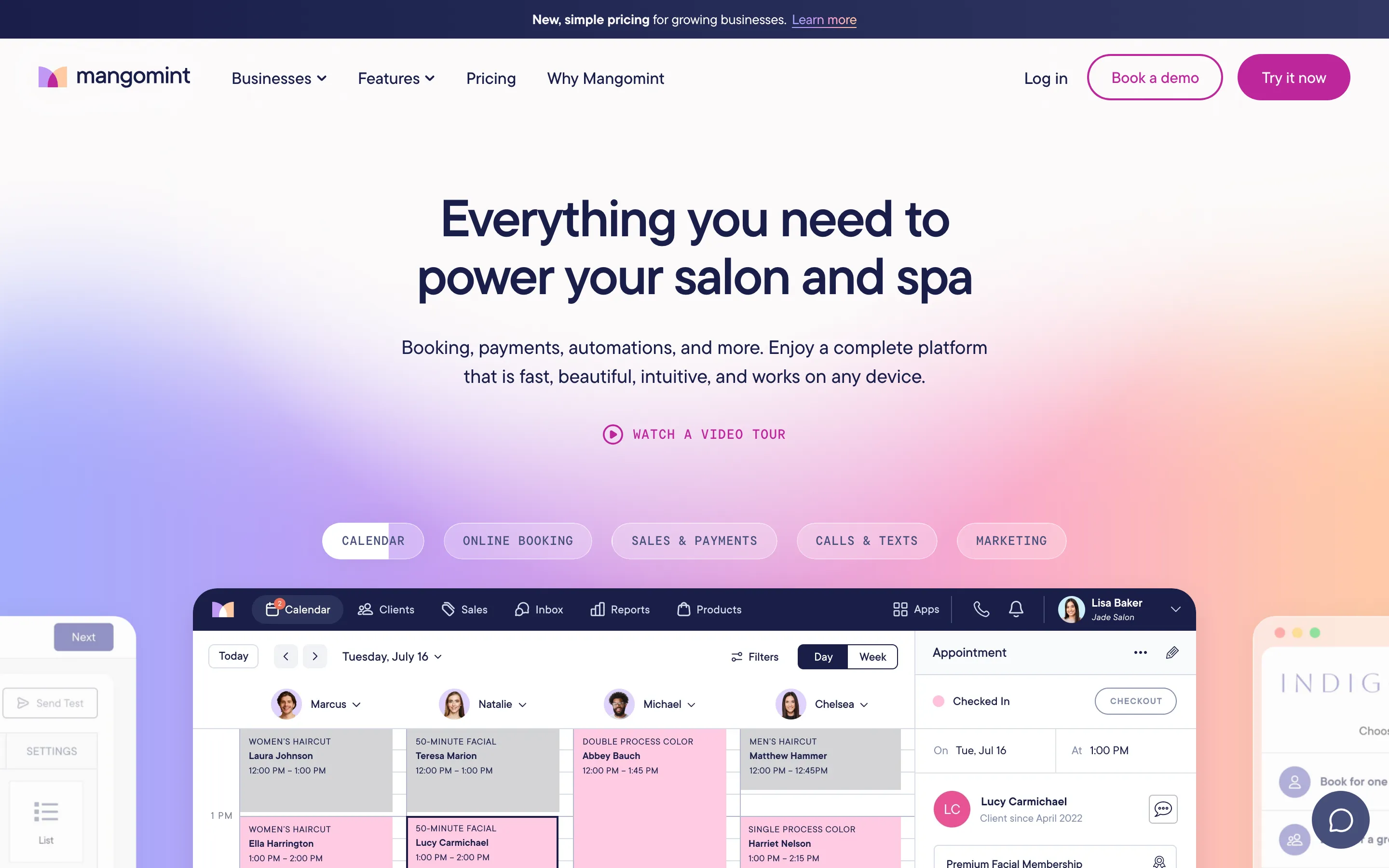
- **Mangomint** — salon blush x scheduling grid (https://www.mangomint.com/). Screenshot: library/mangomint/hero.png
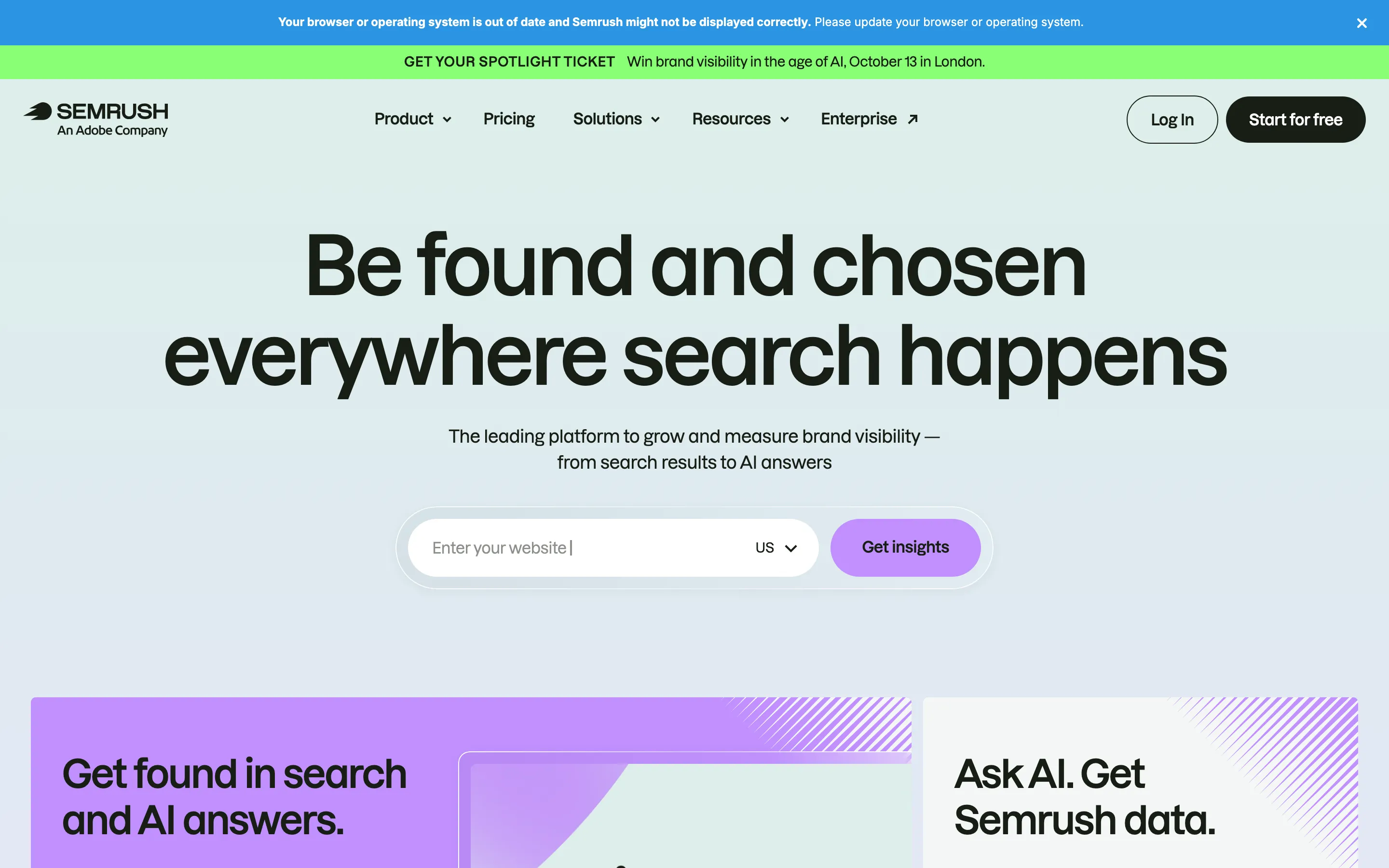
- **Semrush** — mint-lavender wash x search pill (https://www.semrush.com/). Screenshot: library/semrush/hero.png
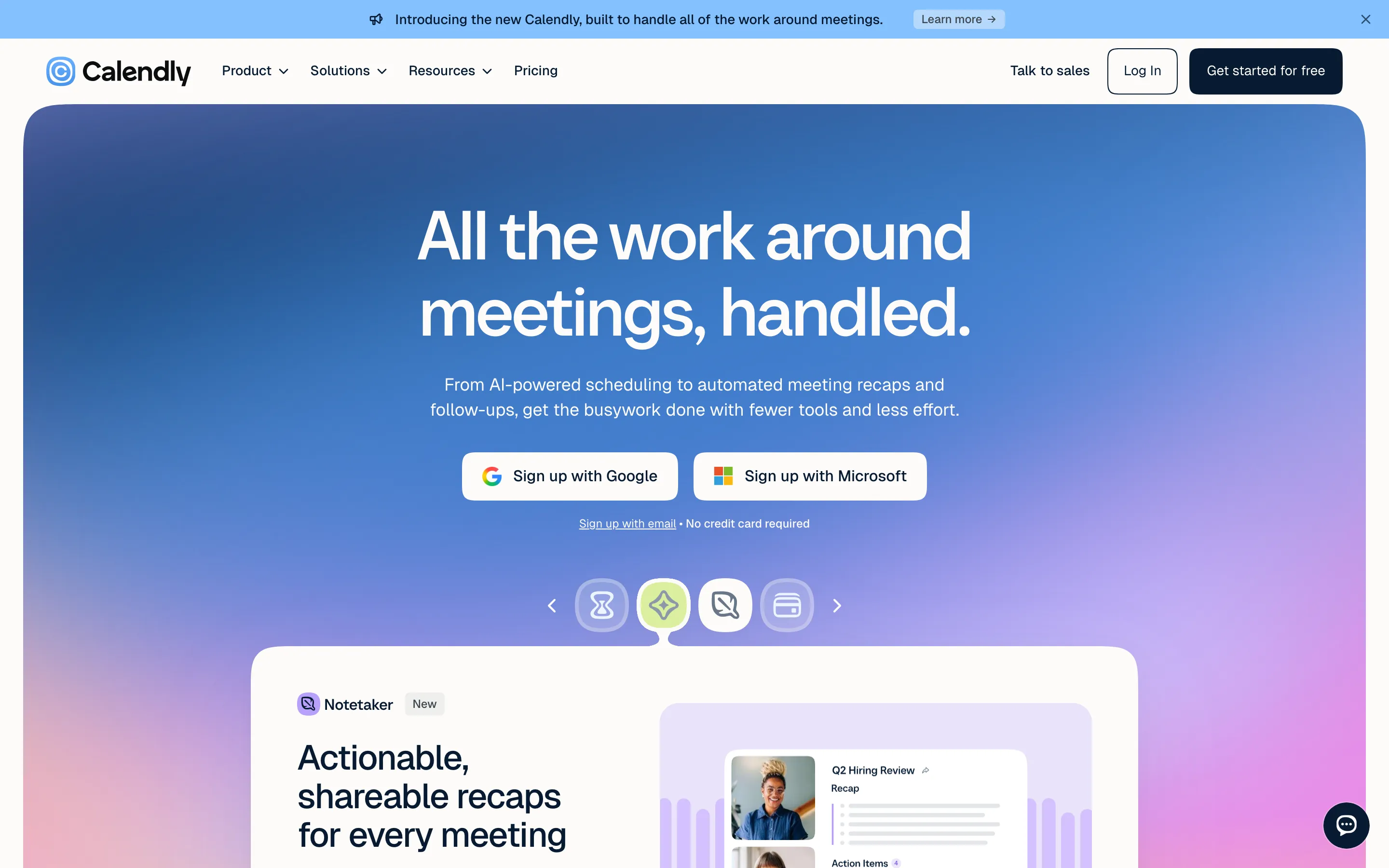
- **Calendly** — blue keynote x product carousel (https://calendly.com/). Screenshot: library/calendly/hero.png
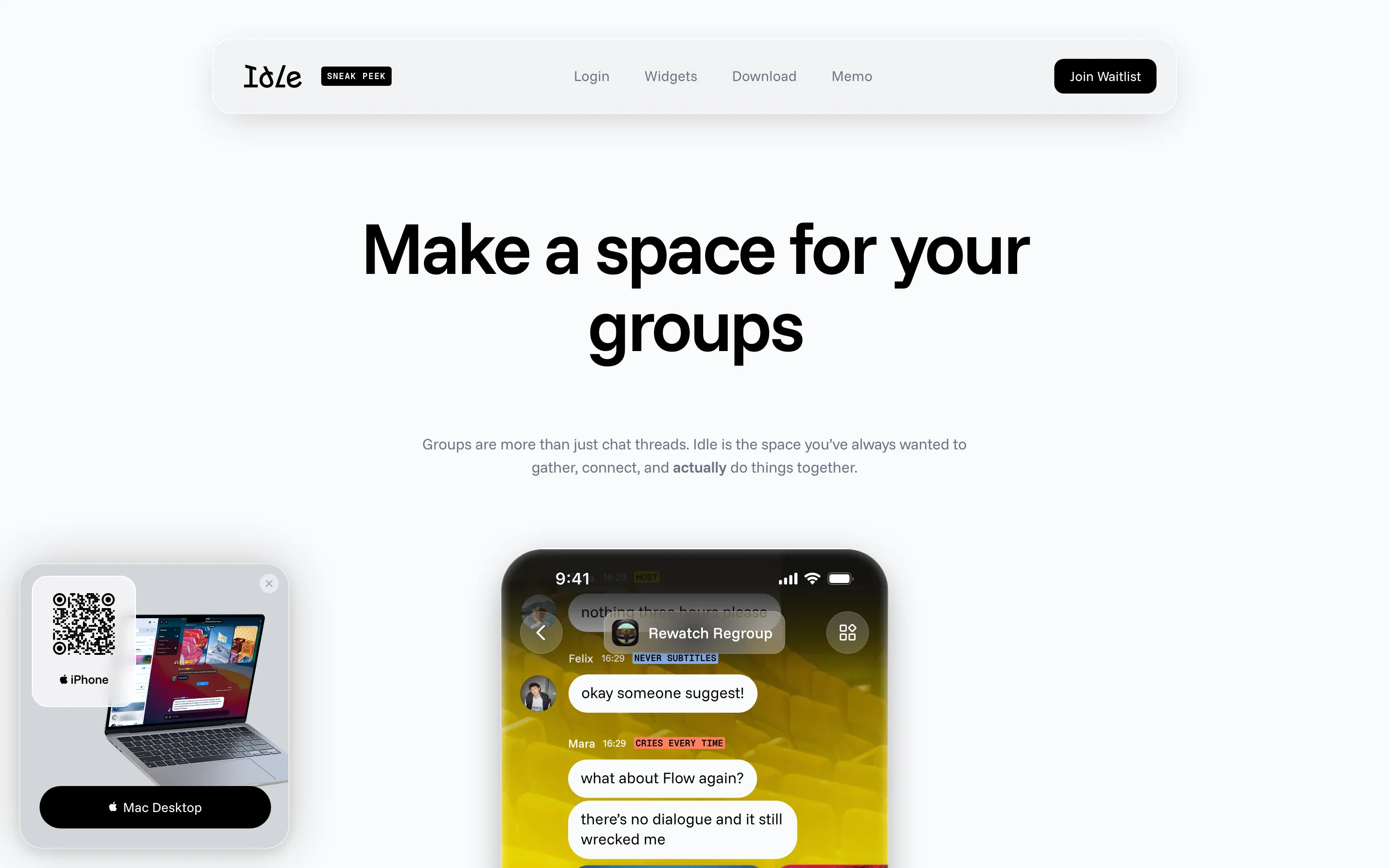
- **Idle** — keynote grotesk x saturated phone screens (https://idle.space/). Screenshot: library/idle/hero.png

## Reference files

- Site: https://goclockout.app/
- Hero screenshot: library/clockout/hero.png
- Full-page screenshot: library/clockout/full.png