
# The Content Architecture — DESIGN.md

> terminal manual x type vortex

**Aesthetic:** Dither Mono · **Mode:** persuade · **Color strategy:** restrained · **Focus:** hero
**Reference:** https://www.contentarchitecture.dev/ (captured 2026-09-18)

Match the feel of this reference, not its content. Hexes and measurements are sampled from the page; type character, materials, and direction are interpreted from screenshots.

A monochrome developer product splits warm machine paper against a black field of concentric mono text, then continues through ASCII diagrams, terminal windows, scanlined work, and hard editorial reversals.

## Colors

| Hex | Role |
|---|---|
| `#f2efe8` | paper ground |
| `#232323` | ink and dark field |
| `#ffffff` | reverse ink |
| `#5b5a56` | secondary ink |
| `#d6a878` | tiny status signal |

## Typography

- **Display:** Geist Sans at ~56px medium, left-aligned, two compact lines
- **Body:** Geist Sans at ~21px regular in a broad technical measure
- **Labels:** Geist Mono at 12–16px, uppercase for system labels and terminal navigation

## Materials

- warm machine paper
- black terminal field
- concentric mono lettering
- ASCII dot matrices
- scanline screenshots
- hard rectangular controls

## Signature details

- split paper terminal hero
- concentric mono type vortex
- floating command bar
- blocky paired buttons
- ASCII architecture diagrams
- scanlined project gallery
- black white section reversals

## Direction

### THESIS

an agent-ready stack is accumulated engineering judgment, so the page behaves like a machine manual whose diagrams are made from its own name. It refuses mascot illustration and glossy code windows.

### OWN-WORLD

warm machine paper #f2efe8 paired with #232323 terminal black, white reverse type, gray secondary copy, and one tiny amber status light. Geist Sans carries claims; Geist Mono owns labels, navigation, diagrams, prices, and prompts. Geometry is hard: zero-radius fields, block buttons, ticker strips, dot matrices, scanlines, and dense radial letterforms.

### STORY

the visitor sees the prepared stack, compares it with rebuilding, follows the decisions already made through a descending technical map, inspects proof in a scanlined gallery, then chooses an edition.

### FIRST VIEWPORT

split the viewport exactly in half. On paper at left, position an uppercase mono kicker, a two-line sans claim, a four-line explanation, and two joined black buttons. On black at right, fill the entire field with concentric rings of white mono text tightening into a small center. Float a compact terminal navigation bar across the seam near the top. Add tiny version and learn-more controls at opposite bottom corners.

### FORM

a developer field manual crossed with a command-line boot screen. Motion: not observed; if used, rotate the text rings slowly and keep every interface block fixed.

## Avoid

- Do not soften with gradients or anti-aliased illustration; the constraint is the style.
- Drifting into the `broadsheet-hairline-mono (adjacent: mono labels and editorial black-white structure; terminal mechanics replace serif and hairline polish)` AI-default cluster; this reference sits near it, so keep the details that separate it.
# The Content Architecture — DESIGN.md

> terminal manual x type vortex

**Aesthetic:** Dither Mono · **Mode:** persuade · **Color strategy:** restrained · **Focus:** hero
**Reference:** https://www.contentarchitecture.dev/ (captured 2026-09-18)

Match the feel of this reference, not its content. Hexes and measurements are sampled from the page; type character, materials, and direction are interpreted from screenshots.

A monochrome developer product splits warm machine paper against a black field of concentric mono text, then continues through ASCII diagrams, terminal windows, scanlined work, and hard editorial reversals.

## Aesthetic — Dither Mono

One or two inks and a dither: ordered or diffusion-dithered imagery, bitmap or mono type, hard edges, and the discipline of a machine that could only print black. Reads as early computing, fax, and risograph at once.

- **Vocabulary:** dither, ordered dither, bitmap, 1-bit, riso, mono, scanline, hard edge
- **Materials:** dithered photography, bitmap type, solid ink fields
- **Color strategy:** committed

## Colors

| Hex | Token | Role |
|---|---|---|
| `#f2efe8` | `--color-paper-ground` | paper ground |
| `#232323` | `--color-ink-and-dark-field` | ink and dark field |
| `#ffffff` | `--color-reverse-ink` | reverse ink |
| `#5b5a56` | `--color-secondary-ink` | secondary ink |
| `#d6a878` | `--color-tiny-status-signal` | tiny status signal |

## Typography

- **Display:** Geist Sans at ~56px medium, left-aligned, two compact lines
- **Body:** Geist Sans at ~21px regular in a broad technical measure
- **Labels:** Geist Mono at 12–16px, uppercase for system labels and terminal navigation
- **Detected fonts:** Geist Mono, Geist Sans

## Materials

- warm machine paper
- black terminal field
- concentric mono lettering
- ASCII dot matrices
- scanline screenshots
- hard rectangular controls

## Signature details

- split paper terminal hero
- concentric mono type vortex
- floating command bar
- blocky paired buttons
- ASCII architecture diagrams
- scanlined project gallery
- black white section reversals

## Direction

### THESIS

an agent-ready stack is accumulated engineering judgment, so the page behaves like a machine manual whose diagrams are made from its own name. It refuses mascot illustration and glossy code windows.

### OWN-WORLD

warm machine paper #f2efe8 paired with #232323 terminal black, white reverse type, gray secondary copy, and one tiny amber status light. Geist Sans carries claims; Geist Mono owns labels, navigation, diagrams, prices, and prompts. Geometry is hard: zero-radius fields, block buttons, ticker strips, dot matrices, scanlines, and dense radial letterforms.

### STORY

the visitor sees the prepared stack, compares it with rebuilding, follows the decisions already made through a descending technical map, inspects proof in a scanlined gallery, then chooses an edition.

### FIRST VIEWPORT

split the viewport exactly in half. On paper at left, position an uppercase mono kicker, a two-line sans claim, a four-line explanation, and two joined black buttons. On black at right, fill the entire field with concentric rings of white mono text tightening into a small center. Float a compact terminal navigation bar across the seam near the top. Add tiny version and learn-more controls at opposite bottom corners.

### FORM

a developer field manual crossed with a command-line boot screen. Motion: not observed; if used, rotate the text rings slowly and keep every interface block fixed.

## Hero image prompt

Replace the `[SUBJECT]` with your own subject, then send to Higgsfield gpt_image_2 @ 2K.

```text
[SUBJECT: concentric rings made from repeated technical lettering and tiny architecture marks] rendered as white monospace glyphs on a flat charcoal-black (#232323) field, dense radial spacing, scattered one-pixel dots, faint scanline texture, one tiny amber indicator, no readable text, no gradients, square crop with a precise centered vanishing point
```

## Avoid

- Do not soften with gradients or anti-aliased illustration; the constraint is the style.
- Drifting into the `broadsheet-hairline-mono (adjacent: mono labels and editorial black-white structure; terminal mechanics replace serif and hairline polish)` AI-default cluster; this reference sits near it, so keep the details that separate it.

## Guardrails

### Always
- Commit to one visual world per page; one hand made everything.
- Real content and real product truth. No invented customers, prices, or benchmarks.
- A visible primary action within the first viewport on persuade surfaces.
- Type set with intent: a display face with a point of view, sizes from a scale, tabular numerals for data.
- Motion with weight: staggered reveals, long easing, nothing bouncy.
- Transitions between hero and body that feel designed, not a hard cut.

### Never
- Purple or blue-purple gradients, glowing edges, "3D SaaS blobs".
- Inter (or any default system grotesk) as the display face.
- The AI default clusters unless the brief pins them: cream ground + high-contrast serif + terracotta accent; near-black + one neon accent; broadsheet hairlines + italic serif + tracked mono labels.
- Generic feature grids of three icon cards.
- Stock illustration mixed with photography.
- Emoji as icons.
- Centered-everything layouts with no reading order.

## Quick start

### CSS custom properties

```css
:root {
  /* Colors */
  --color-paper-ground: #f2efe8;
  --color-ink-and-dark-field: #232323;
  --color-reverse-ink: #ffffff;
  --color-secondary-ink: #5b5a56;
  --color-tiny-status-signal: #d6a878;
}
```

### Tailwind v4

```css
@theme {
  /* Colors */
  --color-paper-ground: #f2efe8;
  --color-ink-and-dark-field: #232323;
  --color-reverse-ink: #ffffff;
  --color-secondary-ink: #5b5a56;
  --color-tiny-status-signal: #d6a878;
}
```

### Extracted from the live site

```css
--ascii-transition-bg: #000;
--ascii-transition-color: #fff;
```

## Similar in the library

- **Agiloft** — monumental serif x contract console (https://www.agiloft.com/). Screenshot: library/agiloft/hero.png
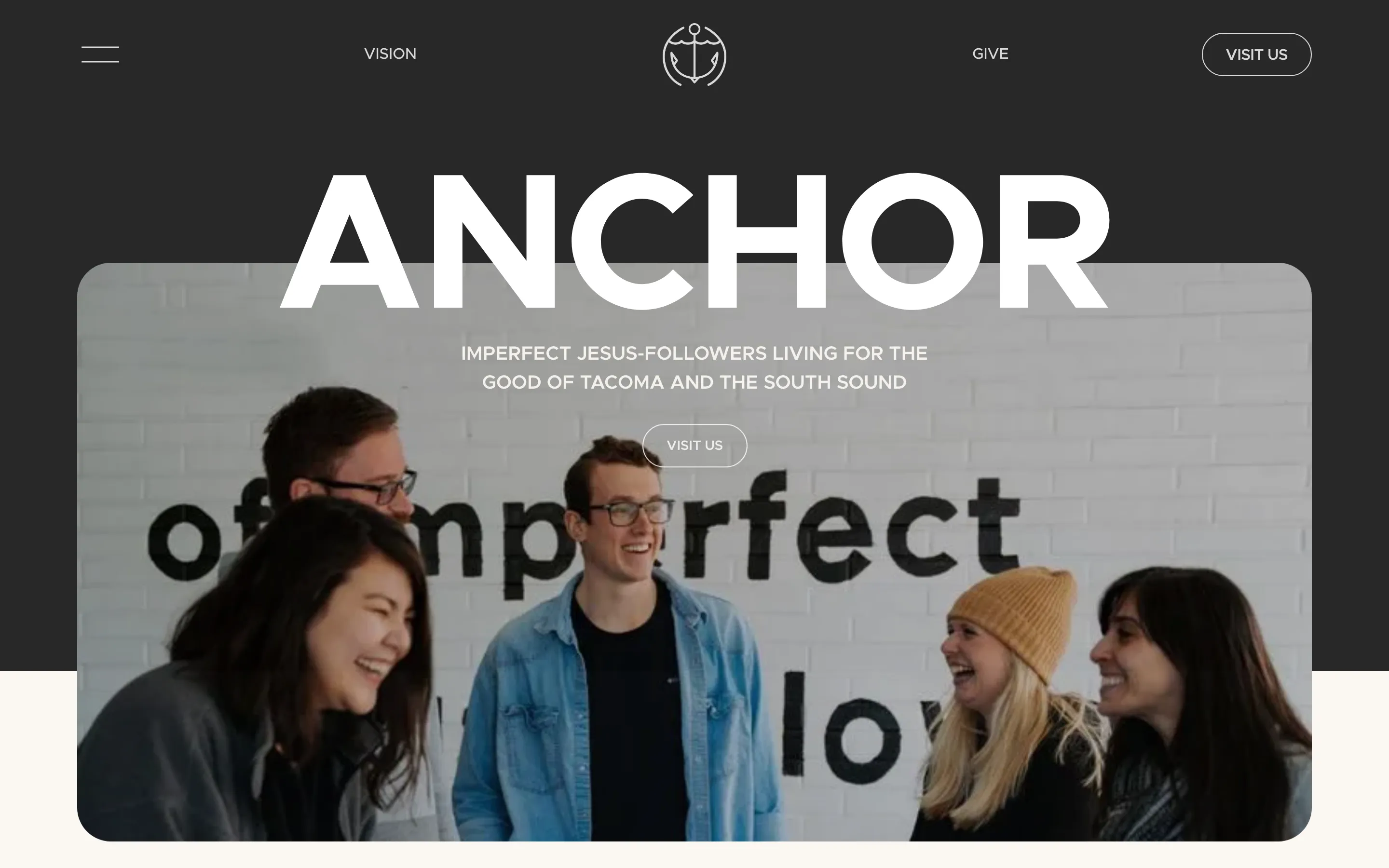
- **Anchor Church** — monumental wordmark x neighborhood portrait (https://anchortacoma.org/). Screenshot: library/anchor-tacoma/hero.png
- **Conversion** — serif prospectus x teal controls (https://conversion.ai/). Screenshot: library/conversion/hero.png
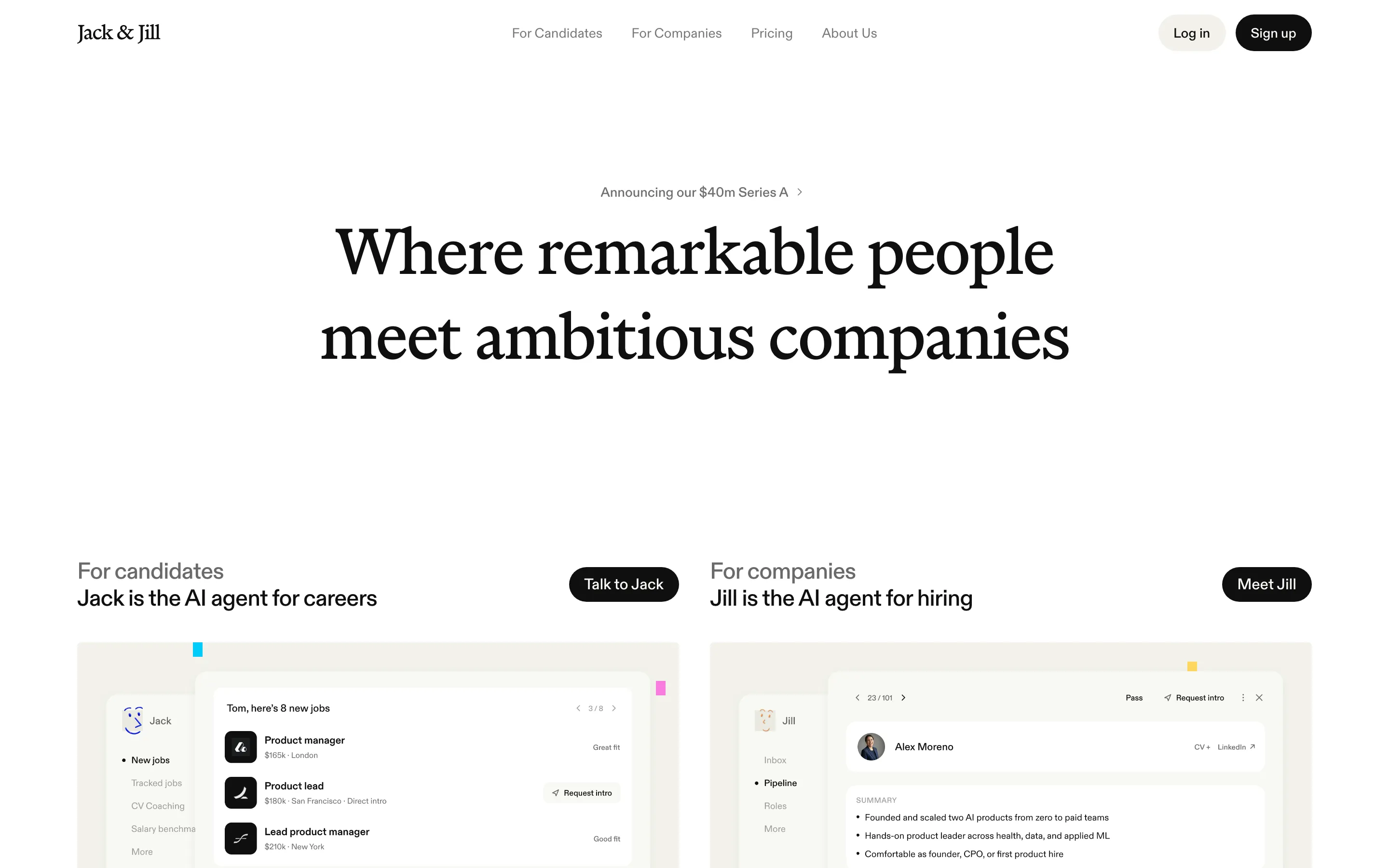
- **Jack & Jill** — text serif x paper product cards (https://www.jackandjill.ai/). Screenshot: library/jackandjill/hero.png

## Reference files

- Site: https://www.contentarchitecture.dev/
- Hero screenshot: library/content-architecture/hero.png
- Full-page screenshot: library/content-architecture/full.png