
# September Works — DESIGN.md

> editorial serif x night interface

**Aesthetic:** After-Hours Interface · **Mode:** persuade · **Color strategy:** full-palette · **Focus:** hero
**Reference:** https://www.september.works/ (captured 2026-09-18)

Match the feel of this reference, not its content. Hexes and measurements are sampled from the page; type character, materials, and direction are interpreted from screenshots.

A design studio turns its pitch into an after-dark operating surface, pairing an enormous high-contrast serif statement with status pills, dim control cards, coded glyphs, and signal-color accents.

## Colors

| Hex | Role |
|---|---|
| `#10100f` | screen ground |
| `#f7f7f3` | primary ink and action |
| `#2a2a2a` | control surfaces and inline highlights |
| `#fe5f2f` | concept signal and coral chapter |
| `#f2c849` | brand signal and ochre chapter |
| `#debdff` | product signal and lilac chapter |

## Typography

- **Display:** Nib Pro high-contrast serif at ~76px regular, sentence case, tight leading, left-aligned; selected words sit in charcoal rounded fields
- **Body:** Suisse Intl Book grotesk at ~16px with compact leading
- **Labels:** Suisse Intl at ~15px sentence case inside rounded controls; micro labels stay plain rather than tracked

## Materials

- near-black screen ground
- charcoal rounded control surfaces
- soft white serif type
- flat signal-color rails
- thin geometric line glyphs
- full-bleed color chapter panels

## Signature details

- near-black screen ground
- oversized serif statement
- inline charcoal highlights
- rounded status pills
- dim control card row
- signal color rails
- geometric interface glyphs
- stacked color chapters

## Direction

### THESIS

a design studio should feel like an interface that remains awake after everyone leaves; the pitch itself becomes the product demo. It refuses portfolio thumbnails, device mockups, and luminous cyber effects.

### OWN-WORLD

a near-black #10100f screen with soft-white #f7f7f3 ink; charcoal #2a2a2a rounded controls; four flat signal colors—coral, yellow, lilac, and muted olive—used first as narrow vertical rails and later as full chapter fields. Set the main claim in Nib Pro, an airy high-contrast serif, against Suisse Intl for all controls and copy. Components are squat radius-heavy pills, wide control cards, red live dots, half-moon toggles, and faint single-line geometric glyphs.

### STORY

the visitor meets the studio's promise as one oversized sentence, reads four compact ways the studio can help, then moves through four color-coded principles before reaching a single connect action.

### FIRST VIEWPORT

place a two-line serif wordmark at the upper left. At the upper right, align a square theme toggle, a long status pill reading like a live presence indicator, and one white Connect button. Fill the upper-middle with a left-aligned serif statement spanning roughly two-thirds of the viewport; wrap its final two phrases in separate charcoal rounded rectangles so language behaves like selected UI. Anchor four equal-width charcoal cards across the bottom, each with a colored rail at left, a two-line label, and a faint glyph at right. Leave the center-right empty and dark.

### FORM

a studio manifesto rendered as an idle operating system. Motion: not observed; if added, restrict it to status changes, glyph response, and crisp panel transitions.

## Avoid

- A dark ground plus colored glows becomes generic cyber-SaaS; keep the colors flat, the controls functional, and let editorial type—not effects—carry the atmosphere.
- Drifting into the `near-black-neon-glow (adjacent: near-black ground and isolated bright accents; flat color, matte controls, and editorial serif type replace neon glow)` AI-default cluster; this reference sits near it, so keep the details that separate it.
# September Works — DESIGN.md

> editorial serif x night interface

**Aesthetic:** After-Hours Interface · **Mode:** persuade · **Color strategy:** full-palette · **Focus:** hero
**Reference:** https://www.september.works/ (captured 2026-09-18)

Match the feel of this reference, not its content. Hexes and measurements are sampled from the page; type character, materials, and direction are interpreted from screenshots.

A design studio turns its pitch into an after-dark operating surface, pairing an enormous high-contrast serif statement with status pills, dim control cards, coded glyphs, and signal-color accents.

## Aesthetic — After-Hours Interface

Studio and product pages staged as an interface left running after dark: a near-black operating surface, oversized editorial serif language, charcoal status pills and control cards, tiny geometric glyphs, and isolated signal colors that later expand into full section fields.

- **Vocabulary:** night mode, status pill, editorial serif, control card, inline highlight, signal color, interface glyph, dark field
- **Materials:** near-black screen ground, charcoal control surfaces, soft white display type, flat signal-color fields, thin geometric line glyphs
- **Color strategy:** full-palette

## Colors

| Hex | Token | Role |
|---|---|---|
| `#10100f` | `--color-screen-ground` | screen ground |
| `#f7f7f3` | `--color-primary-ink-and-action` | primary ink and action |
| `#2a2a2a` | `--color-control-surfaces-and-inline-highlights` | control surfaces and inline highlights |
| `#fe5f2f` | `--color-concept-signal-and-coral-chapter` | concept signal and coral chapter |
| `#f2c849` | `--color-brand-signal-and-ochre-chapter` | brand signal and ochre chapter |
| `#debdff` | `--color-product-signal-and-lilac-chapter` | product signal and lilac chapter |

## Typography

- **Display:** Nib Pro high-contrast serif at ~76px regular, sentence case, tight leading, left-aligned; selected words sit in charcoal rounded fields
- **Body:** Suisse Intl Book grotesk at ~16px with compact leading
- **Labels:** Suisse Intl at ~15px sentence case inside rounded controls; micro labels stay plain rather than tracked
- **Detected fonts:** Suisse Intl Book, Suisse Intl, Nib Pro

## Materials

- near-black screen ground
- charcoal rounded control surfaces
- soft white serif type
- flat signal-color rails
- thin geometric line glyphs
- full-bleed color chapter panels

## Signature details

- near-black screen ground
- oversized serif statement
- inline charcoal highlights
- rounded status pills
- dim control card row
- signal color rails
- geometric interface glyphs
- stacked color chapters

## Direction

### THESIS

a design studio should feel like an interface that remains awake after everyone leaves; the pitch itself becomes the product demo. It refuses portfolio thumbnails, device mockups, and luminous cyber effects.

### OWN-WORLD

a near-black #10100f screen with soft-white #f7f7f3 ink; charcoal #2a2a2a rounded controls; four flat signal colors—coral, yellow, lilac, and muted olive—used first as narrow vertical rails and later as full chapter fields. Set the main claim in Nib Pro, an airy high-contrast serif, against Suisse Intl for all controls and copy. Components are squat radius-heavy pills, wide control cards, red live dots, half-moon toggles, and faint single-line geometric glyphs.

### STORY

the visitor meets the studio's promise as one oversized sentence, reads four compact ways the studio can help, then moves through four color-coded principles before reaching a single connect action.

### FIRST VIEWPORT

place a two-line serif wordmark at the upper left. At the upper right, align a square theme toggle, a long status pill reading like a live presence indicator, and one white Connect button. Fill the upper-middle with a left-aligned serif statement spanning roughly two-thirds of the viewport; wrap its final two phrases in separate charcoal rounded rectangles so language behaves like selected UI. Anchor four equal-width charcoal cards across the bottom, each with a colored rail at left, a two-line label, and a faint glyph at right. Leave the center-right empty and dark.

### FORM

a studio manifesto rendered as an idle operating system. Motion: not observed; if added, restrict it to status changes, glyph response, and crisp panel transitions.

## Hero image prompt

Replace the `[SUBJECT]` with your own subject, then send to Higgsfield gpt_image_2 @ 2K.

```text
[SUBJECT: four compact interface status modules with abstract geometric glyphs] rendered as matte vector UI objects on a near-black (#10100f) screen, charcoal (#2a2a2a) rounded rectangles with one narrow flat signal rail per module in coral (#fe5f2f), yellow (#f2c849), lilac (#debdff), and muted olive, hairline gray symbols, soft diffuse screen light, straight-on orthographic framing, no glow, no gradients, no text, wide landscape composition with generous empty black space above
```

## Avoid

- A dark ground plus colored glows becomes generic cyber-SaaS; keep the colors flat, the controls functional, and let editorial type—not effects—carry the atmosphere.
- Drifting into the `near-black-neon-glow (adjacent: near-black ground and isolated bright accents; flat color, matte controls, and editorial serif type replace neon glow)` AI-default cluster; this reference sits near it, so keep the details that separate it.

## Guardrails

### Always
- Commit to one visual world per page; one hand made everything.
- Real content and real product truth. No invented customers, prices, or benchmarks.
- A visible primary action within the first viewport on persuade surfaces.
- Type set with intent: a display face with a point of view, sizes from a scale, tabular numerals for data.
- Motion with weight: staggered reveals, long easing, nothing bouncy.
- Transitions between hero and body that feel designed, not a hard cut.

### Never
- Purple or blue-purple gradients, glowing edges, "3D SaaS blobs".
- Inter (or any default system grotesk) as the display face.
- The AI default clusters unless the brief pins them: cream ground + high-contrast serif + terracotta accent; near-black + one neon accent; broadsheet hairlines + italic serif + tracked mono labels.
- Generic feature grids of three icon cards.
- Stock illustration mixed with photography.
- Emoji as icons.
- Centered-everything layouts with no reading order.

## Quick start

### CSS custom properties

```css
:root {
  /* Colors */
  --color-screen-ground: #10100f;
  --color-primary-ink-and-action: #f7f7f3;
  --color-control-surfaces-and-inline-highlights: #2a2a2a;
  --color-concept-signal-and-coral-chapter: #fe5f2f;
  --color-brand-signal-and-ochre-chapter: #f2c849;
  --color-product-signal-and-lilac-chapter: #debdff;
}
```

### Tailwind v4

```css
@theme {
  /* Colors */
  --color-screen-ground: #10100f;
  --color-primary-ink-and-action: #f7f7f3;
  --color-control-surfaces-and-inline-highlights: #2a2a2a;
  --color-concept-signal-and-coral-chapter: #fe5f2f;
  --color-brand-signal-and-ochre-chapter: #f2c849;
  --color-product-signal-and-lilac-chapter: #debdff;
}
```

## Similar in the library

- **Agiloft** — monumental serif x contract console (https://www.agiloft.com/). Screenshot: library/agiloft/hero.png
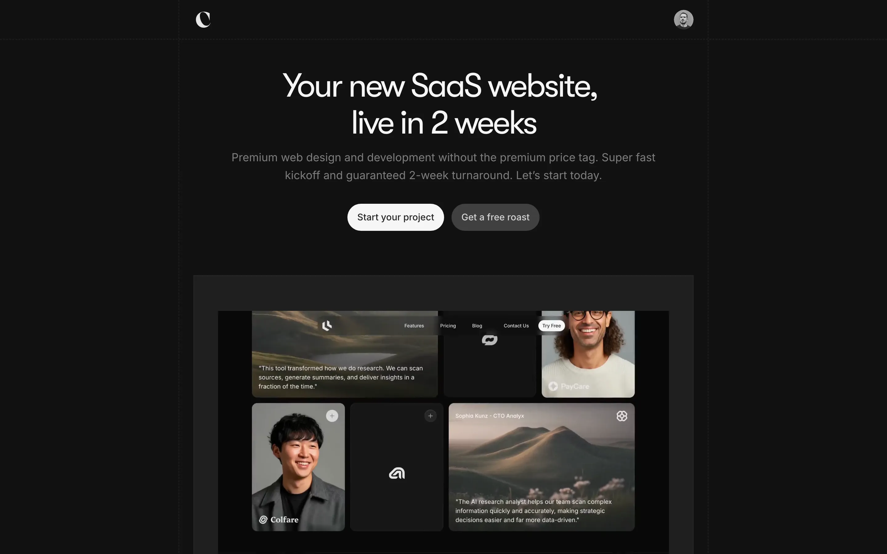
- **Crafted** — dark studio x framed launch reel (https://www.crafted.is/). Screenshot: library/crafted/hero.png
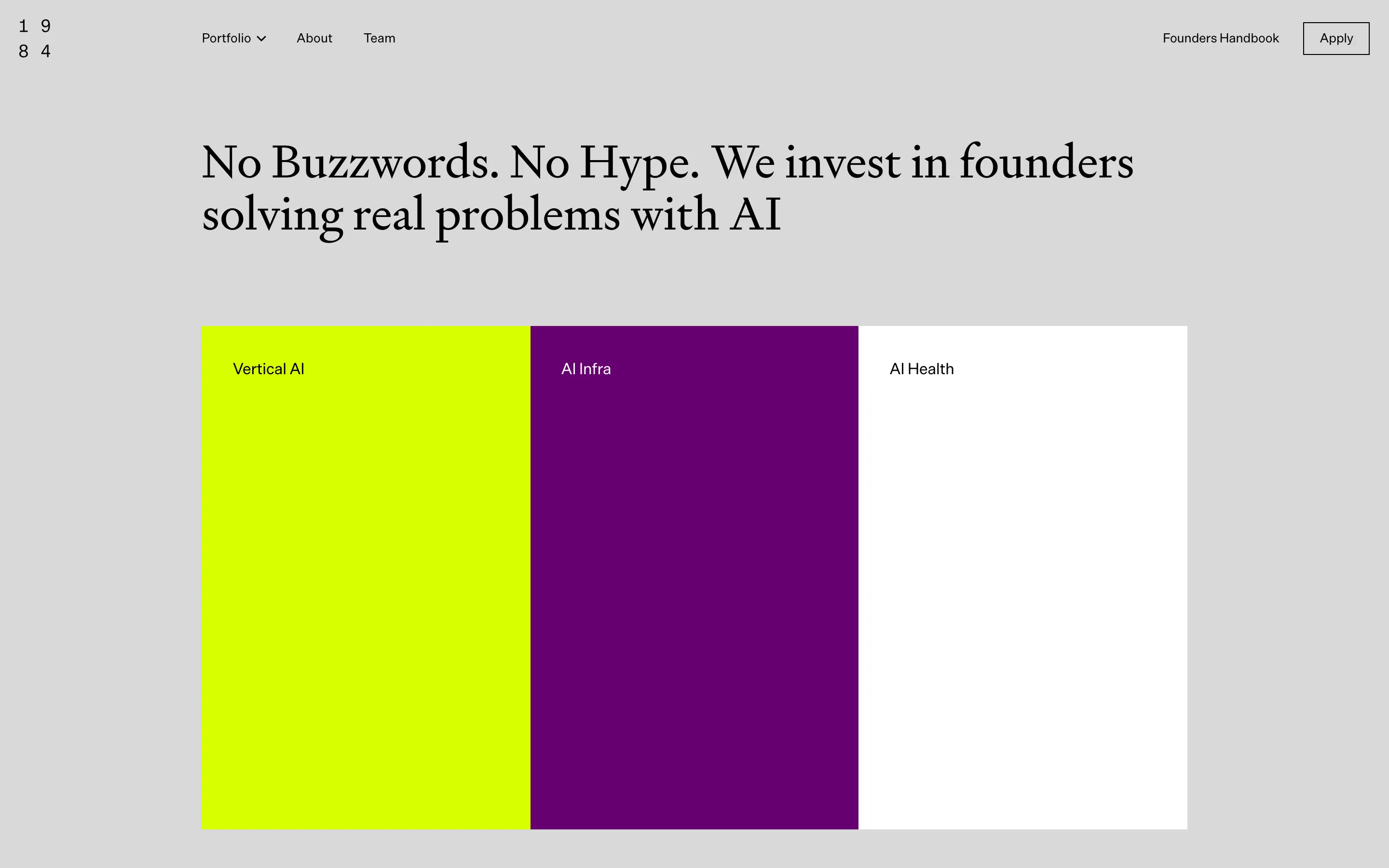
- **1984 Ventures** — flat color blocks x gray annual report (https://1984.vc/). Screenshot: library/1984/hero.png
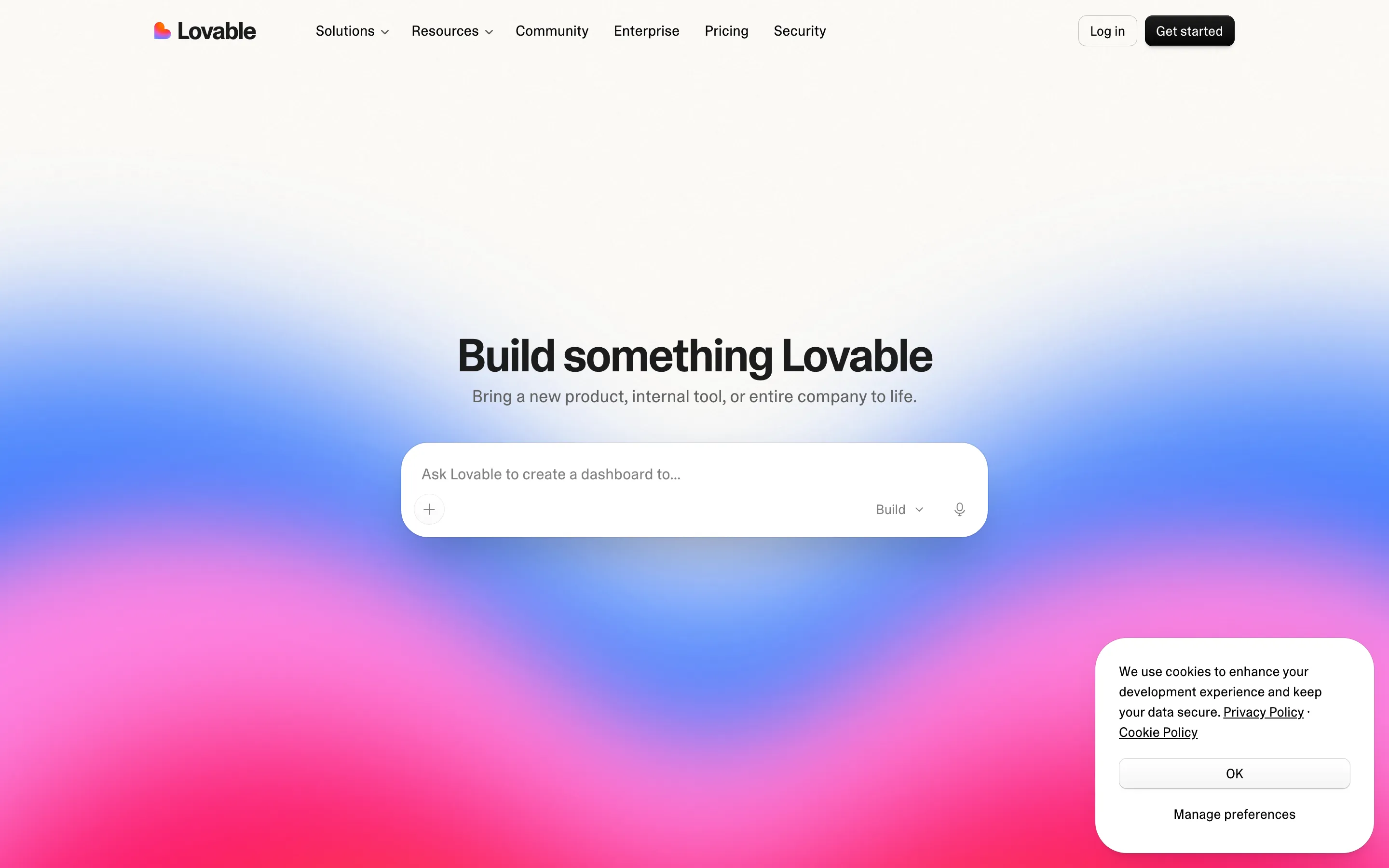
- **Lovable** — prompt box x sunset gradient (https://lovable.dev/). Screenshot: library/lovable/hero.png

## Reference files

- Site: https://www.september.works/
- Hero screenshot: library/september-works/hero.png
- Full-page screenshot: library/september-works/full.png