
# Mintlify — DESIGN.md

> knowledge currents x docs console

**Aesthetic:** Data-as-Texture · **Mode:** persuade · **Color strategy:** restrained · **Focus:** hero
**Reference:** https://www.mintlify.com/ (captured 2026-09-18)

Match the feel of this reference, not its content. Hexes and measurements are sampled from the page; type character, materials, and direction are interpreted from screenshots.

A white documentation platform makes infrastructure visible as bundles of green signal lines flowing behind a serif claim and into a large, lightly tinted documentation console.

## Colors

| Hex | Role |
|---|---|
| `#fefdfb` | page ground |
| `#121715` | primary ink |
| `#0c8c5e` | interface accent |
| `#7df43b` | signal line highlight |
| `#e9f7f1` | product panel tint |
| `#485450` | secondary ink |

## Typography

- **Display:** Arizona Flare serif at ~62px regular, left-aligned, three compact lines
- **Body:** Inter at ~20px regular with selected nouns in semibold
- **Labels:** Paper Mono for traffic readouts; Inter medium for navigation and buttons

## Materials

- white screen ground
- bundled vector signal lines
- mint-tinted docs panels
- fine interface borders
- mono traffic readouts
- line-art feature tiles

## Signature details

- white infrastructure ground
- green signal line bundles
- serif knowledge headline
- agent traffic readout
- oversized docs console
- mint grid illustrations
- modular product tile system

## Direction

### THESIS

knowledge infrastructure is a current that continuously feeds products and agents; the signal lines are the architecture. It refuses the static documentation screenshot floating in empty space.

### OWN-WORLD

a warm white #fefdfb field, near-black #121715 ink, forest green #0c8c5e controls, and many hairline currents shifting from mint through acid green. Use Arizona Flare for the central claim, Inter for explanation and controls, and Paper Mono for live metrics. Product surfaces are thin-bordered white panels with pale mint tile wells and tiny line-art objects.

### STORY

the visitor sees the infrastructure promise, watches the docs console receive the signal, then follows the current through knowledge access, system connections, scale proof, customer stories, and updates.

### FIRST VIEWPORT

place a slim report banner above a spacious nav. Left-align a small traffic readout, a three-line serif headline, a two-line lead, and two actions. Fill the right half with an oversized documentation console cropped by the viewport. Route two bundles of green lines diagonally behind it—one descending from the upper right, one rising from the lower left—so the console appears connected rather than floating.

### FORM

a network diagram flowing through a documentation workspace. Motion: not observed; if used, move a few line pulses along fixed paths while keeping panels still.

## Avoid

- Do not let decorative data claim things the product cannot show; texture, not evidence.
# Mintlify — DESIGN.md

> knowledge currents x docs console

**Aesthetic:** Data-as-Texture · **Mode:** persuade · **Color strategy:** restrained · **Focus:** hero
**Reference:** https://www.mintlify.com/ (captured 2026-09-18)

Match the feel of this reference, not its content. Hexes and measurements are sampled from the page; type character, materials, and direction are interpreted from screenshots.

A white documentation platform makes infrastructure visible as bundles of green signal lines flowing behind a serif claim and into a large, lightly tinted documentation console.

## Aesthetic — Data-as-Texture

Charts, tables, coordinates, ticks, and numerals used as surface and ornament rather than only as information. The product's data becomes the wallpaper, the divider, and the illustration.

- **Vocabulary:** tick marks, ledger, tabular numerals, grid, plot, coordinates, callout, readout
- **Materials:** fine grid lines, tabular mono numerals, line plots as illustration, data callouts
- **Color strategy:** restrained

## Colors

| Hex | Token | Role |
|---|---|---|
| `#fefdfb` | `--color-page-ground` | page ground |
| `#121715` | `--color-primary-ink` | primary ink |
| `#0c8c5e` | `--color-interface-accent` | interface accent |
| `#7df43b` | `--color-signal-line-highlight` | signal line highlight |
| `#e9f7f1` | `--color-product-panel-tint` | product panel tint |
| `#485450` | `--color-secondary-ink` | secondary ink |

## Typography

- **Display:** Arizona Flare serif at ~62px regular, left-aligned, three compact lines
- **Body:** Inter at ~20px regular with selected nouns in semibold
- **Labels:** Paper Mono for traffic readouts; Inter medium for navigation and buttons
- **Detected fonts:** Inter, Paper Mono, Arizona Flare

## Materials

- white screen ground
- bundled vector signal lines
- mint-tinted docs panels
- fine interface borders
- mono traffic readouts
- line-art feature tiles

## Signature details

- white infrastructure ground
- green signal line bundles
- serif knowledge headline
- agent traffic readout
- oversized docs console
- mint grid illustrations
- modular product tile system

## Direction

### THESIS

knowledge infrastructure is a current that continuously feeds products and agents; the signal lines are the architecture. It refuses the static documentation screenshot floating in empty space.

### OWN-WORLD

a warm white #fefdfb field, near-black #121715 ink, forest green #0c8c5e controls, and many hairline currents shifting from mint through acid green. Use Arizona Flare for the central claim, Inter for explanation and controls, and Paper Mono for live metrics. Product surfaces are thin-bordered white panels with pale mint tile wells and tiny line-art objects.

### STORY

the visitor sees the infrastructure promise, watches the docs console receive the signal, then follows the current through knowledge access, system connections, scale proof, customer stories, and updates.

### FIRST VIEWPORT

place a slim report banner above a spacious nav. Left-align a small traffic readout, a three-line serif headline, a two-line lead, and two actions. Fill the right half with an oversized documentation console cropped by the viewport. Route two bundles of green lines diagonally behind it—one descending from the upper right, one rising from the lower left—so the console appears connected rather than floating.

### FORM

a network diagram flowing through a documentation workspace. Motion: not observed; if used, move a few line pulses along fixed paths while keeping panels still.

## Hero image prompt

Replace the `[SUBJECT]` with your own subject, then send to Higgsfield gpt_image_2 @ 2K.

```text
[SUBJECT: a documentation workspace connected to several knowledge sources] drawn as a precise white interface console with mint-tinted cards, surrounded by dozens of thin vector currents flowing diagonally in mint, emerald, and acid green, warm white (#fefdfb) ground, flat technical lighting, no text, wide frame with empty space at upper left
```

## Avoid

- Do not let decorative data claim things the product cannot show; texture, not evidence.

## Guardrails

### Always
- Commit to one visual world per page; one hand made everything.
- Real content and real product truth. No invented customers, prices, or benchmarks.
- A visible primary action within the first viewport on persuade surfaces.
- Type set with intent: a display face with a point of view, sizes from a scale, tabular numerals for data.
- Motion with weight: staggered reveals, long easing, nothing bouncy.
- Transitions between hero and body that feel designed, not a hard cut.

### Never
- Purple or blue-purple gradients, glowing edges, "3D SaaS blobs".
- Inter (or any default system grotesk) as the display face.
- The AI default clusters unless the brief pins them: cream ground + high-contrast serif + terracotta accent; near-black + one neon accent; broadsheet hairlines + italic serif + tracked mono labels.
- Generic feature grids of three icon cards.
- Stock illustration mixed with photography.
- Emoji as icons.
- Centered-everything layouts with no reading order.

## Quick start

### CSS custom properties

```css
:root {
  /* Colors */
  --color-page-ground: #fefdfb;
  --color-primary-ink: #121715;
  --color-interface-accent: #0c8c5e;
  --color-signal-line-highlight: #7df43b;
  --color-product-panel-tint: #e9f7f1;
  --color-secondary-ink: #485450;
}
```

### Tailwind v4

```css
@theme {
  /* Colors */
  --color-page-ground: #fefdfb;
  --color-primary-ink: #121715;
  --color-interface-accent: #0c8c5e;
  --color-signal-line-highlight: #7df43b;
  --color-product-panel-tint: #e9f7f1;
  --color-secondary-ink: #485450;
}
```

### Extracted from the live site

```css
--button-primary: #0c8c5e;
--button-neutral: #485450;
--accordion-background-color: #fefdfb;
--accordion-focus-ring: #0c8c5e;
```

## Similar in the library

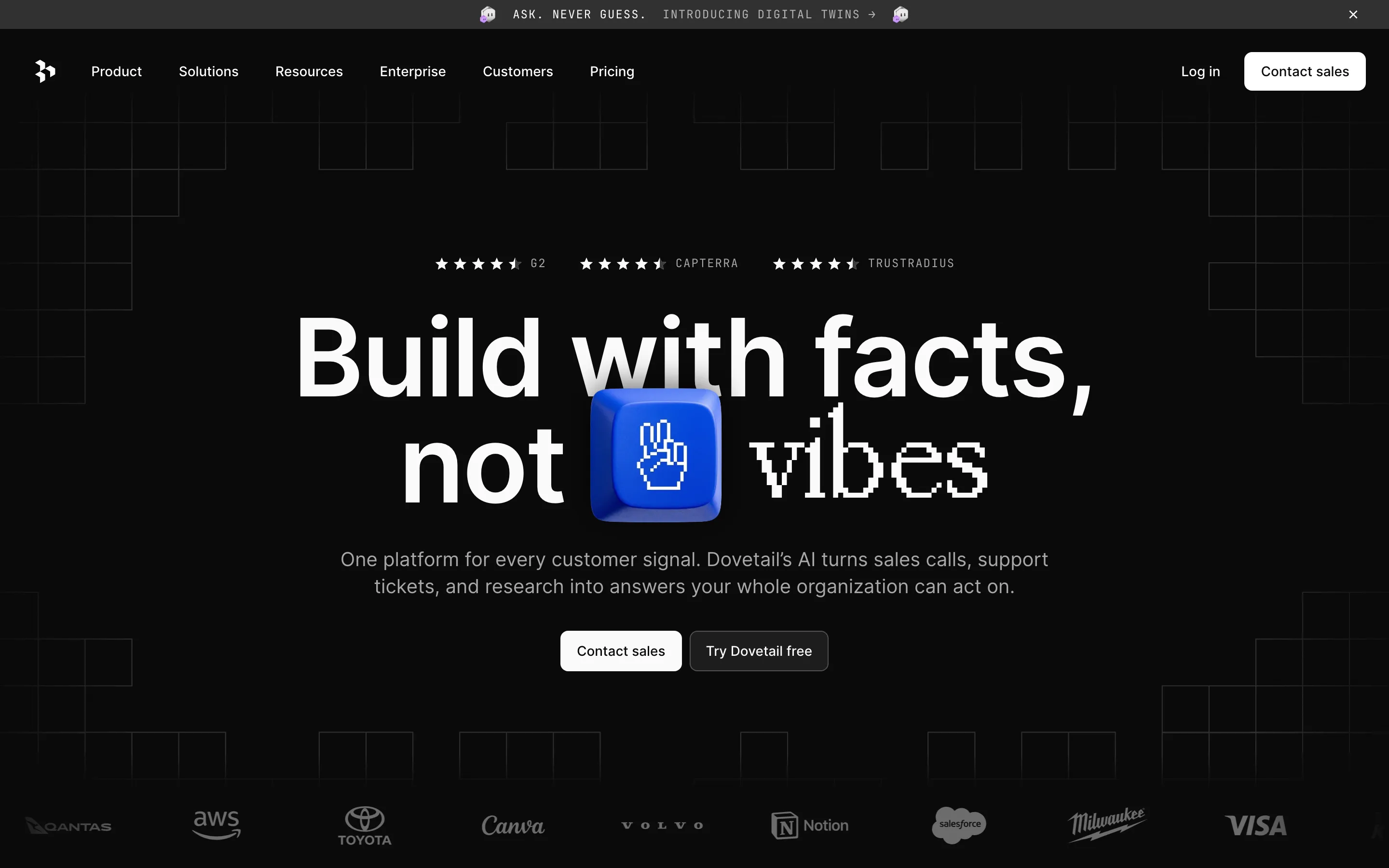
- **Dovetail** — pixel signal x research grid (https://dovetail.com/). Screenshot: library/dovetail/hero.png
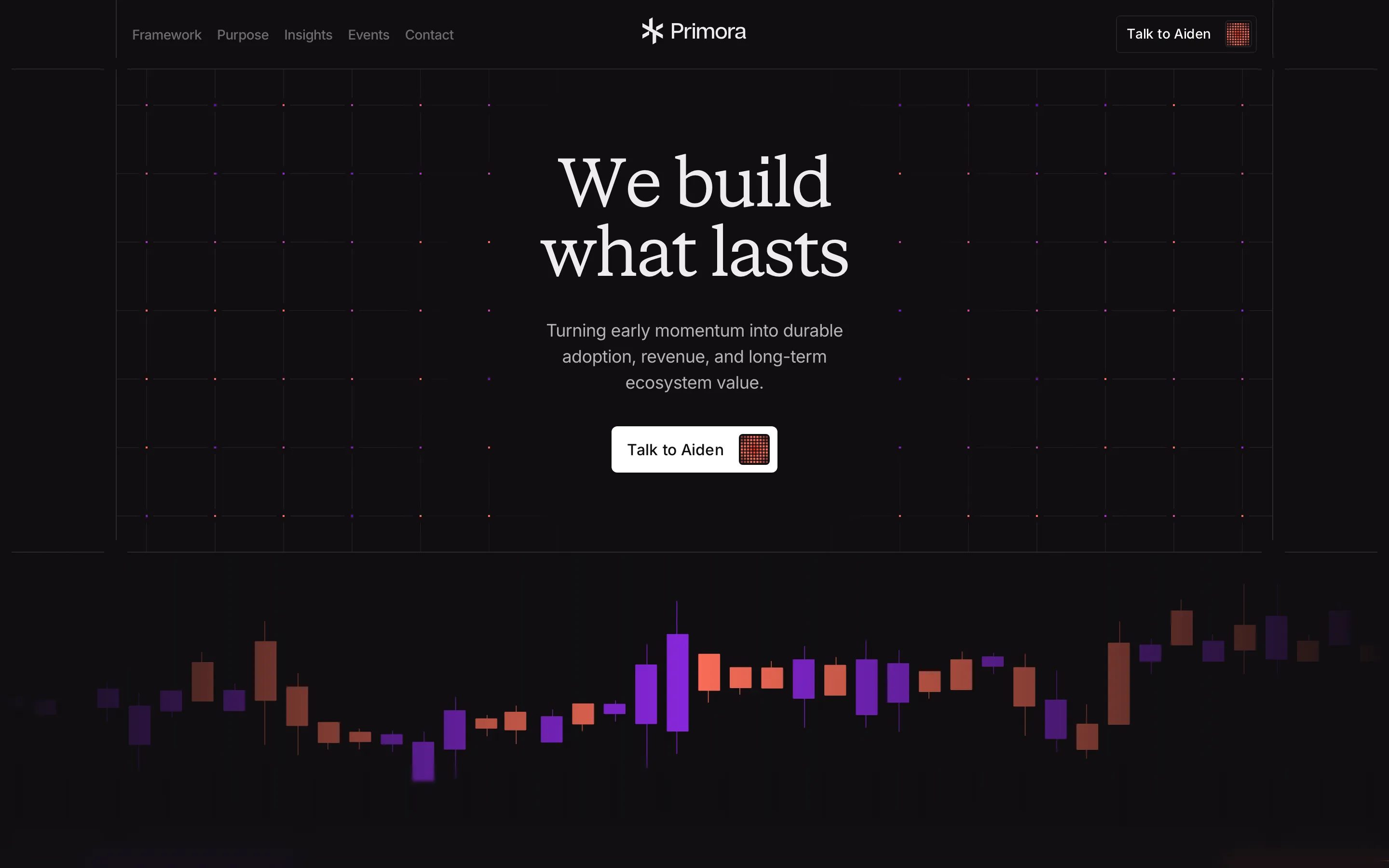
- **Primora** — market chart x patient serif (https://primora.xyz/). Screenshot: library/primora/hero.png
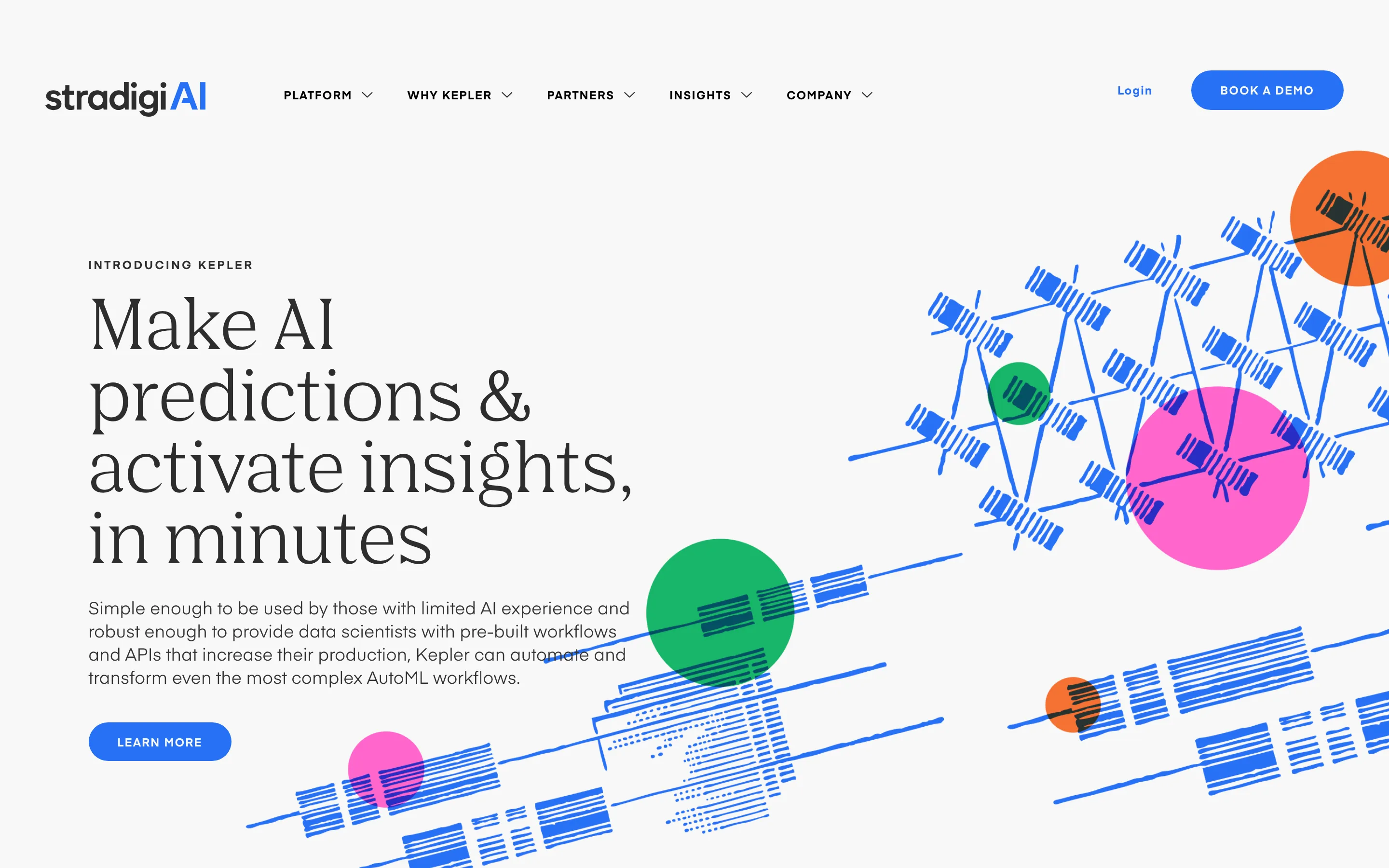
- **Stradigi AI** — editorial serif x scribbled data (https://www.stradigi.ai/). Screenshot: library/stradigi/hero.png
- **Agiloft** — monumental serif x contract console (https://www.agiloft.com/). Screenshot: library/agiloft/hero.png

## Reference files

- Site: https://www.mintlify.com/
- Hero screenshot: library/mintlify/hero.png
- Full-page screenshot: library/mintlify/full.png