# Naehas — DESIGN.md

> urban video x compliance blocks

**Aesthetic:** Blueprint Enterprise · **Mode:** persuade · **Color strategy:** committed · **Focus:** full
**Reference:** https://www.naehas.com/ (captured 2026-09-18)

Match the feel of this reference, not its content. Hexes and measurements are sampled from the page; type character, materials, and direction are interpreted from screenshots.

A bank-software page turns operational authority into a hard-edged system of dark teal fields, electric aqua signals, aerial city footage, oversize proof metrics, and modular problem cards.

## Colors

| Hex | Role |
|---|---|
| `#093644` | dark teal ground |
| `#ffffff` | bright content ground |
| `#1feddb` | aqua signal accent |
| `#ed861f` | orange wayfinding accent |
| `#f4f4f4` | secondary section ground |
| `#212121` | body ink |

## Typography

- **Display:** Gilroy heavy grotesk at ~52px in the hero and ~34px in sections, sentence case, tight leading
- **Body:** Gilroy regular at ~17px with compact measures and open leading
- **Labels:** Gilroy semibold at ~12–14px; aqua and orange used as category and direction cues

## Materials

- darkened aerial video
- flat teal color fields
- electric aqua bars
- square card stock panels
- hard-edged arrow glyphs
- printed report covers

## Signature details

- dark teal utility frame
- aerial city video
- electric aqua signal bars
- oversize proof metrics
- orange arrow glyphs
- alternating field sections
- square problem cards
- whitepaper cover mockup

## Direction

### THESIS

banking operations should feel fast, measurable, and governed, so the page behaves like a high-contrast control map laid over real movement. It refuses soft gradient clouds, decorative dashboards, and rounded-card friendliness.

### OWN-WORLD

dark teal (#093644) is the institutional frame; white is the working surface; electric aqua (#1feddb) marks announcements, actions, and proof; orange (#ed861f) appears only as a directional counter-signal. Use Gilroy throughout, with heavy sentence-case headlines, firm numerals, and compact body copy. Components are square, flush, and grid-aligned. The recurring northeast arrow is both icon and corner device. Aerial city footage, report covers, flat color panels, and hard section cuts are the material language.

### STORY

the visitor first sees speed embodied as motion, then receives quantified outcomes, a problem map, an expert quotation, audience-specific offers, capabilities, insights, and a direct demo invitation.

### FIRST VIEWPORT

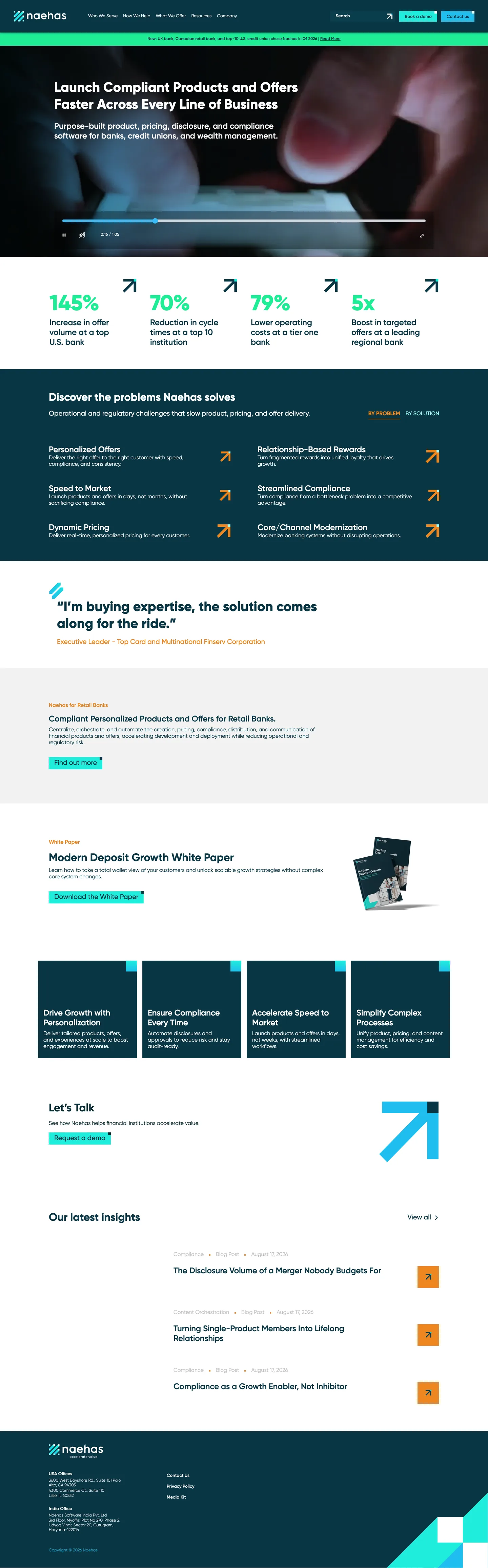
a dark teal navigation band carries the white mark left, five links, a dark search control, and two bright rectangular actions. A thin aqua announcement strip sits below. The hero is a full-width, darkened aerial city video with a two-line white headline and short support copy anchored left; native-looking playback controls span the lower edge. The next white band exposes four large aqua metrics in one row.

### FORM

an enterprise operations board crossed with an urban traffic feed. Motion: the hero video supplies constant lateral movement; keep every other transition immediate and restrained.

## Avoid

- This is the category default; it earns its place only through grid discipline and type scale. Purple-blue gradients, 3D blobs, and icon-card trios are its rut.
# Naehas — DESIGN.md

> urban video x compliance blocks

**Aesthetic:** Blueprint Enterprise · **Mode:** persuade · **Color strategy:** committed · **Focus:** full
**Reference:** https://www.naehas.com/ (captured 2026-09-18)

Match the feel of this reference, not its content. Hexes and measurements are sampled from the page; type character, materials, and direction are interpreted from screenshots.

A bank-software page turns operational authority into a hard-edged system of dark teal fields, electric aqua signals, aerial city footage, oversize proof metrics, and modular problem cards.

## Aesthetic — Blueprint Enterprise

B2B enterprise marketing drawn on graph paper: grid-lined grounds (faint on white, blueprint-white on navy), one saturated primary blue with a warm secondary, bold or light grotesk headlines at large scale, stat cards, logo strips, badge walls, and mono caps section labels. The category standard for enterprise software, played with discipline.

- **Vocabulary:** blueprint grid, stat card, logo strip, badge wall, primary blue, mono caps label, pill button, highlighted word
- **Materials:** fine grid lines on the ground, flat color panels, product screenshots in cards, gray stat wells
- **Color strategy:** committed

## Colors

| Hex | Token | Role |
|---|---|---|
| `#093644` | `--color-dark-teal-ground` | dark teal ground |
| `#ffffff` | `--color-bright-content-ground` | bright content ground |
| `#1feddb` | `--color-aqua-signal-accent` | aqua signal accent |
| `#ed861f` | `--color-orange-wayfinding-accent` | orange wayfinding accent |
| `#f4f4f4` | `--color-secondary-section-ground` | secondary section ground |
| `#212121` | `--color-body-ink` | body ink |

## Typography

- **Display:** Gilroy heavy grotesk at ~52px in the hero and ~34px in sections, sentence case, tight leading
- **Body:** Gilroy regular at ~17px with compact measures and open leading
- **Labels:** Gilroy semibold at ~12–14px; aqua and orange used as category and direction cues
- **Detected fonts:** gilroy

## Materials

- darkened aerial video
- flat teal color fields
- electric aqua bars
- square card stock panels
- hard-edged arrow glyphs
- printed report covers

## Signature details

- dark teal utility frame
- aerial city video
- electric aqua signal bars
- oversize proof metrics
- orange arrow glyphs
- alternating field sections
- square problem cards
- whitepaper cover mockup

## Direction

### THESIS

banking operations should feel fast, measurable, and governed, so the page behaves like a high-contrast control map laid over real movement. It refuses soft gradient clouds, decorative dashboards, and rounded-card friendliness.

### OWN-WORLD

dark teal (#093644) is the institutional frame; white is the working surface; electric aqua (#1feddb) marks announcements, actions, and proof; orange (#ed861f) appears only as a directional counter-signal. Use Gilroy throughout, with heavy sentence-case headlines, firm numerals, and compact body copy. Components are square, flush, and grid-aligned. The recurring northeast arrow is both icon and corner device. Aerial city footage, report covers, flat color panels, and hard section cuts are the material language.

### STORY

the visitor first sees speed embodied as motion, then receives quantified outcomes, a problem map, an expert quotation, audience-specific offers, capabilities, insights, and a direct demo invitation.

### FIRST VIEWPORT

a dark teal navigation band carries the white mark left, five links, a dark search control, and two bright rectangular actions. A thin aqua announcement strip sits below. The hero is a full-width, darkened aerial city video with a two-line white headline and short support copy anchored left; native-looking playback controls span the lower edge. The next white band exposes four large aqua metrics in one row.

### FORM

an enterprise operations board crossed with an urban traffic feed. Motion: the hero video supplies constant lateral movement; keep every other transition immediate and restrained.

## Hero image prompt

Replace the `[SUBJECT]` with your own subject, then send to Higgsfield gpt_image_2 @ 2K.

```text
[SUBJECT: an aerial view of a dense city intersection with cars crossing in several directions] filmed at dusk from directly overhead, dark teal color grade (#093644), streaks of electric aqua (#1feddb) and restrained warm orange (#ed861f) light, crisp architectural geometry, slight motion blur from traffic, high contrast, no text, no logos, wide landscape frame with the left-center kept darker for white typography
```

## Avoid

- This is the category default; it earns its place only through grid discipline and type scale. Purple-blue gradients, 3D blobs, and icon-card trios are its rut.

## Guardrails

### Always
- Commit to one visual world per page; one hand made everything.
- Real content and real product truth. No invented customers, prices, or benchmarks.
- A visible primary action within the first viewport on persuade surfaces.
- Type set with intent: a display face with a point of view, sizes from a scale, tabular numerals for data.
- Motion with weight: staggered reveals, long easing, nothing bouncy.
- Transitions between hero and body that feel designed, not a hard cut.

### Never
- Purple or blue-purple gradients, glowing edges, "3D SaaS blobs".
- Inter (or any default system grotesk) as the display face.
- The AI default clusters unless the brief pins them: cream ground + high-contrast serif + terracotta accent; near-black + one neon accent; broadsheet hairlines + italic serif + tracked mono labels.
- Generic feature grids of three icon cards.
- Stock illustration mixed with photography.
- Emoji as icons.
- Centered-everything layouts with no reading order.

## Quick start

### CSS custom properties

```css
:root {
  /* Colors */
  --color-dark-teal-ground: #093644;
  --color-bright-content-ground: #ffffff;
  --color-aqua-signal-accent: #1feddb;
  --color-orange-wayfinding-accent: #ed861f;
  --color-secondary-section-ground: #f4f4f4;
  --color-body-ink: #212121;
}
```

### Tailwind v4

```css
@theme {
  /* Colors */
  --color-dark-teal-ground: #093644;
  --color-bright-content-ground: #ffffff;
  --color-aqua-signal-accent: #1feddb;
  --color-orange-wayfinding-accent: #ed861f;
  --color-secondary-section-ground: #f4f4f4;
  --color-body-ink: #212121;
}
```

## Similar in the library

- **Upland Software** — geometric bold x graph paper (https://uplandsoftware.com/). Screenshot: library/upland/hero.png
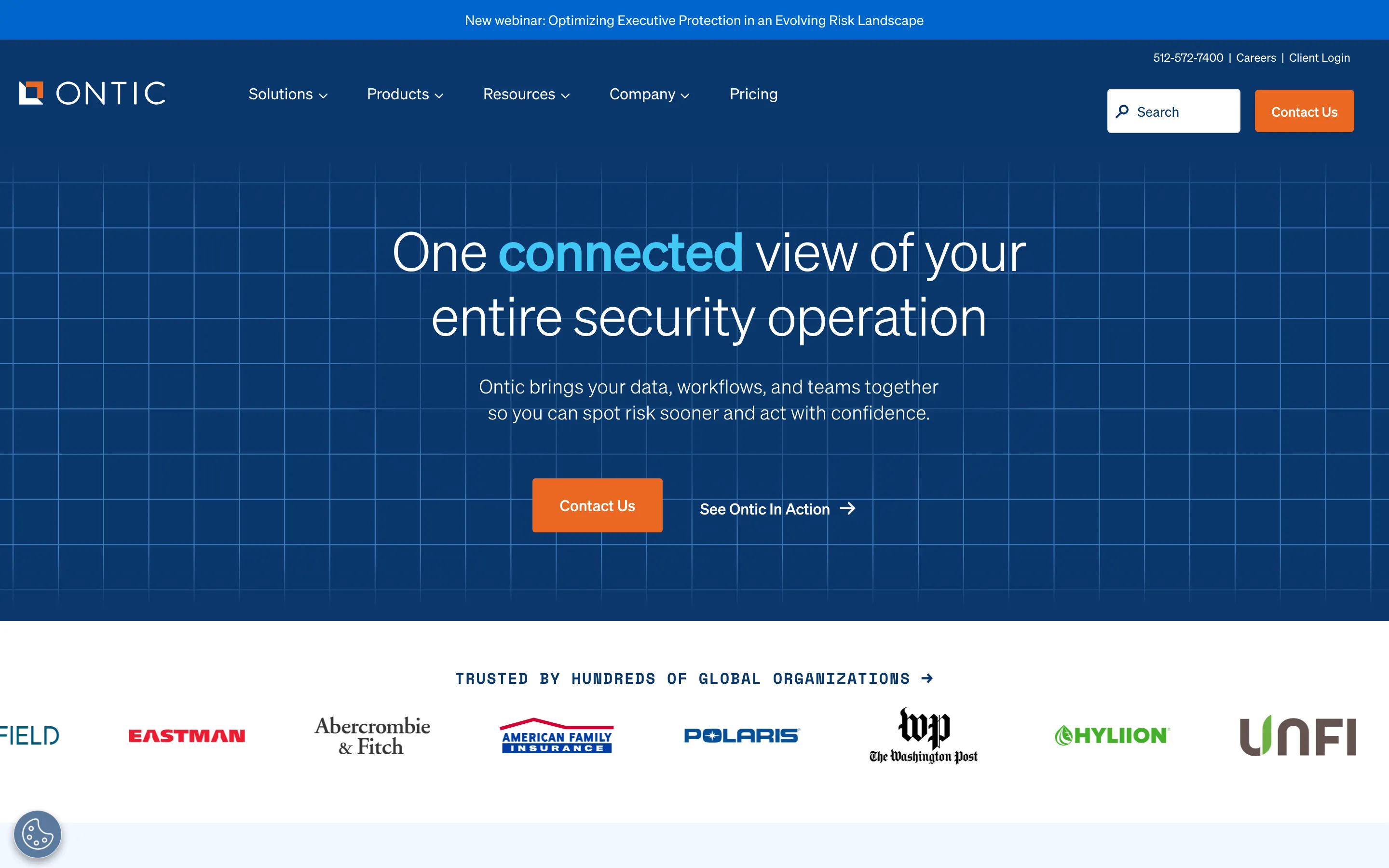
- **Ontic** — navy blueprint x mono labels (https://ontic.co/). Screenshot: library/ontic/hero.png
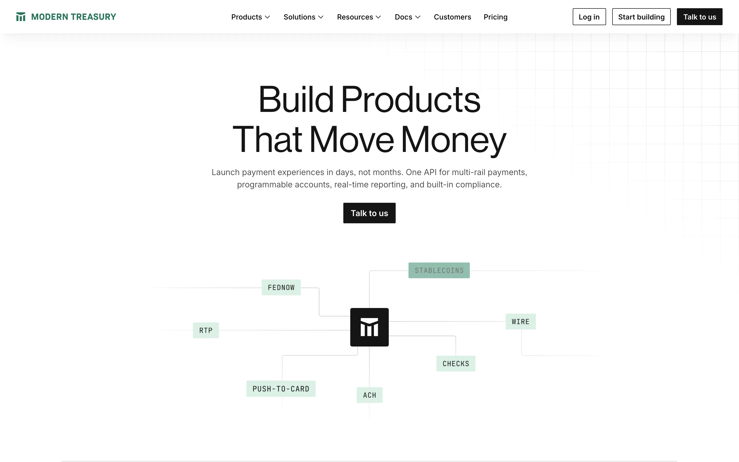
- **Modern Treasury** — ledger grid x payment rails (https://www.moderntreasury.com/). Screenshot: library/modern-treasury/hero.png
- **Decimal** — ruled frame x marigold button (https://www.decimal.app/). Screenshot: library/decimal/hero.png

## Reference files

- Site: https://www.naehas.com/
- Hero screenshot: library/naehas/hero.png
- Full-page screenshot: library/naehas/full.png